
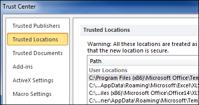
In the old days, if you opened a file that contained macros, a warning message popped up on the screen. That has changed, and now Excel 2010 runs macros without enabling, in some situations.
Change All Pivot Charts With One Filter
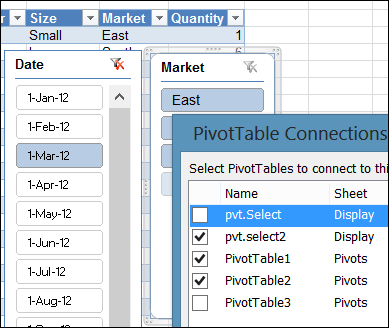
Slicers were introduced in Excel 2010, and they make it easy to change multiple pivot tables with a single click.
Note: In earlier versions, you can use programming to change the report filters in multiples pivot tables.
Add Picture to Excel Comment
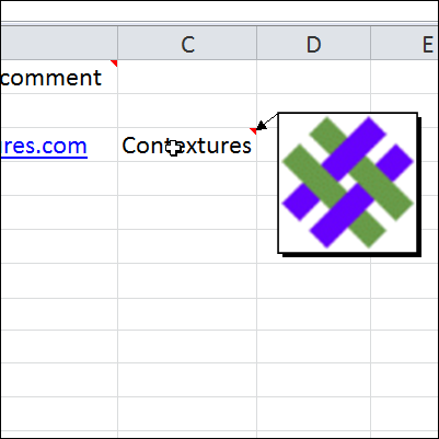
Things have been hectic this week. I got a new laptop, with Window 8, and have spent hours installing software, and getting all my settings the way I like them.
I’ve also installed the latest version of Excel 2013, and am using it for my daily work, so there’s lots of new stuff to play with and learn.
Continue reading “Add Picture to Excel Comment”
Excel Budget Template
Are you still working on your budget for next year? I’ve just updated my budget template, and added a page on my website, to describe how it works.
The old version was created in 2002, so it was definitely time for an update! This is a simple budget layout, but might give you some ideas for working on your own workbook.
The Menu Sheet
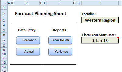
There is a menu sheet at the front of the workbook, with two named cells – Location and Start Date. The information that you enter in those cells is used on the other sheets in the workbook.
There are four navigation buttons, to take you to the data entry sheets and the report sheets. And those sheets have a Menu button, to bring you back to the menu sheet.
Data Entry Sheets
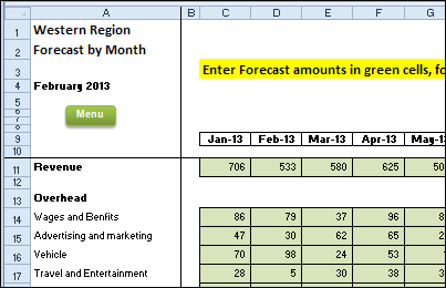
When you’re in the planning phase, you can enter your budget categories and forecasts on the Forecast sheet.
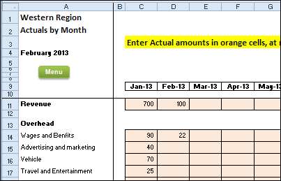
Later, when you have Actual numbers, you can enter those on the Actual worksheet.
Year To Date Reports
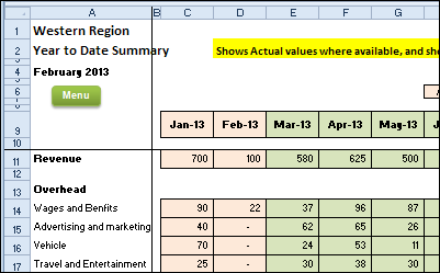
To see how things are going, you can check the Year to Date report, which shows the Actual amounts, up to the current month, and Forecast amounts for the remaining months.
Conditional formatting colours the columns with Actual data, to it’s easy to see where it’s been entered.
Variance Report
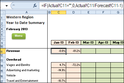
The final report shows the variance between the forecast amounts and the actual amounts. Again, conditional formatting colours the columns with Actual data.
Download the Sample File
To see the details, and to download the sample file, please visit the Forecast vs Actual – Variance page on my Contextures website. The file is in Excel xlsm format, and the workbook contains macros.
__________________
Scroll Bar Changes Excel Chart Title
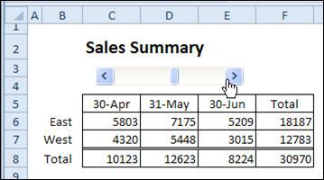
Last week, I shared a tip for using a scroll bar to change the date range in a report. The scroll bar selects the end date for the report, and the columns to the left show the two previous months.
It works very nicely, without programming, and makes it easy to view a different date range.
Link Chart Title to Worksheet Cell
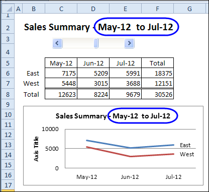
This week, we’ll add a chart that shows the data for the selected date range. Then, we’ll change the worksheet heading to a formula, so it shows the selected dates. Finally, we’ll link the chart title to the heading cells, so it also shows the selected dates.
Oops! You’ll notice that I forgot to change Axis Title, that was added at the left side of the chart. If you use one of the Quick Layout options for charts, watch for those little extras that they might add.
You can see the steps in the video, at the end of this post.
Another Chart Title Example
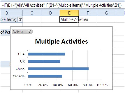
You can see another example of linking a chart title to a worksheet cell in my post on pivot table report filters.
Instead of a simple link, you can use the IF function to affect the result, as in the formula shown below.
Watch the Chart Title Video
To see the steps for creating the chart, and adding the dynamic title, you can watch this short video tutorial.
_____________________
Choose Report Dates With Excel Scroll Bar
This week, I’ve been working on some dashboards, and want to make it easy for people to select a date range for the report.
I experimented with drop down lists and slicers, and finally settled on a good old-fashioned scroll bar. You can click or drag the scroll bar to select an end date, and see three months of sales data, and the total.
Note: The technique does NOT require programming and is fairly easy to set up.

Scroll Bar Select the End Date
The scroll bar on the Summary sheet is linked to a named cell on another sheet, and that number is used in an INDEX / MATCH formula, to calculate the end date.
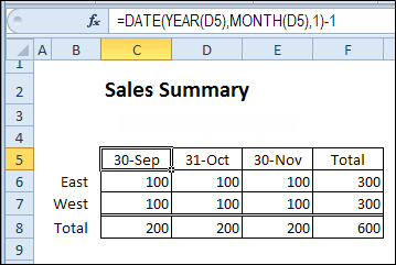
The date headings have formulas that show the selected end date, and the two prior months.
Get Data From a Pivot Table
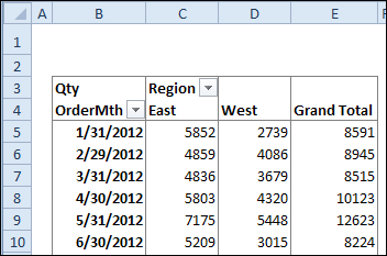
The sales data is summarized in a pivot table, by report month, and region.
GetPivotData Formula
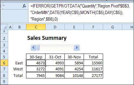
The summary table uses the GETPIVOTDATA function to pull the correct data, based on the region name and the date.
The IFERROR function returns a zero, if the data isn’t found in the pivot table.
Download the Sample File
To download the sample file, and see the written instructions, please visit my Contextures web site: Select Date with Excel Scroll Bar
__________________
Create Table Combinations With MS Query
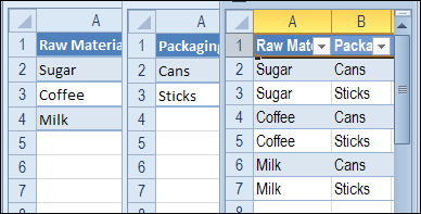
What’s a quick way to combine the items in two table? For example:
- Table A has 3 items – Sugar, Coffee and Milk.
- Table B has 2 items – Cans and Sticks.
Combine Table Items
How can you create a third table that has all the Table 1 items combined with each of the Table 2 items?
- Sugar – Cans, Sugar – Sticks, etc.
Use MS Query
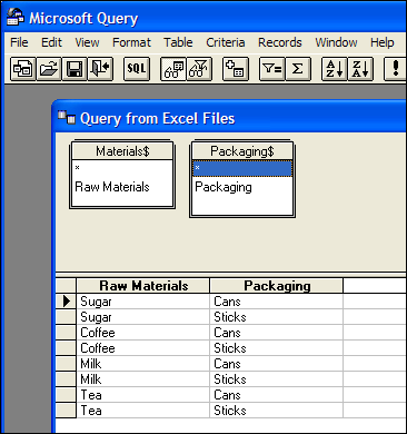
I’ve done this type of item combining with programming before, but this time I used Microsoft Query, to do the work for me.
Add the two tables to the query, with no join line between them, and the results show each item in table 1 connected to each item in table 2.
Read the Details
To see the details for setting this technique up, and refreshing the results table, please visit the Cartesian Join in Excel Using MS Query page on my Contextures website.
The instructions on that show all the steps for creating the MS query, and then sending the query results to Excel, and finally, refreshing the table if the source data changes.
_____________________
Use Excel to Plan Christmas
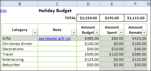
You can mock me if you want to, but every year I use my Excel Christmas planner to keep track of all the things I want to do, over the holiday season.
Where Are the Gifts?
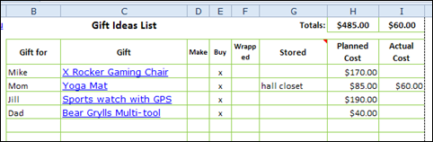
I make a few tweaks to the planner every year, and in this year’s version there is a column to note where you hid a present, after you’ve brought it home.
That should prevent those Christmas Eve panics, while you try to find everything. Not that I’ve ever gone through that – I’m only thinking of you! 😉
Black Friday Shopping Plan
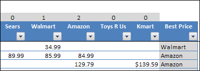
This year, the stores are even advertising Black Friday and Cyber Monday sales in Canada, so I’ll be able to use the Black Friday planning sheet, to find a few bargains.
Based on the prices that you enter, the worksheet calculates which store has the best price for each item, and which store has the most deals.
Note: If prices are the same at multiple stores, the first store will be shown in the “Best Price” column.
Download the Excel Christmas Planner
To download the file, you can visit the Excel Christmas Planner page on my Contextures website.
Happy Thanksgiving, and good luck finding those awesome Black Friday sales tomorrow and in the Cyber Monday sales!
____________________
Show Excel Sparklines for Hidden Data
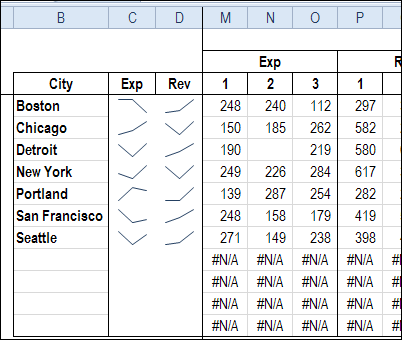
Do you use the sparklines that were introduced in Excel 2010? Last week, I was building a dashboard, and wanted to show sparklines for expenses and revenue.
DSUM and Excel Tables: Sum With Multiple Criteria
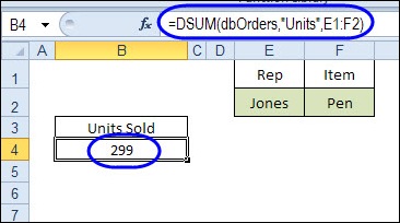
If you need to get a total in Excel, based on criteria, there are a few different ways that you could do it. Today, we’ll take a look at how DSUM and Excel Tables sum with multiple criteria.
Continue reading “DSUM and Excel Tables: Sum With Multiple Criteria”