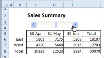
Last week, I shared a tip for using a scroll bar to change the date range in a report. The scroll bar selects the end date for the report, and the columns to the left show the two previous months.
It works very nicely, without programming, and makes it easy to view a different date range.

Link Chart Title to Worksheet Cell
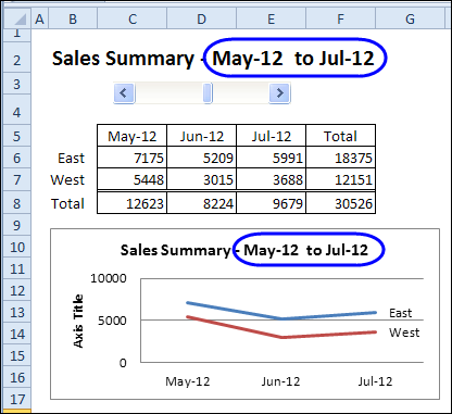
This week, we’ll add a chart that shows the data for the selected date range. Then, we’ll change the worksheet heading to a formula, so it shows the selected dates. Finally, we’ll link the chart title to the heading cells, so it also shows the selected dates.
Oops! You’ll notice that I forgot to change Axis Title, that was added at the left side of the chart. If you use one of the Quick Layout options for charts, watch for those little extras that they might add.
You can see the steps in the video, at the end of this post.

Another Chart Title Example
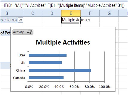
You can see another example of linking a chart title to a worksheet cell in my post on pivot table report filters.
Instead of a simple link, you can use the IF function to affect the result, as in the formula shown below.

Watch the Chart Title Video
To see the steps for creating the chart, and adding the dynamic title, you can watch this short video tutorial.
_____________________

This is awesome information. The way you have explained every concept in the video is commendable. I had this kind of problem while making Joint Venture Cash waterfall model.This article and video would definitely solve my purpose.
Thank you very much.
great information, thank you. video is very help for explain concept thank you
thanks
it was very nice