How to Fix Excel Chart to Show Hidden Data from Worksheet

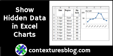
If you create a chart from worksheet data, and then filter the data, some of the chart date might disappear. Sometimes, that’s what you want — filter by Region, and see only the East’s sales in the chart. But, if you always want to see all the data in the chart, try this easy fix.

Note: There’s a similar problem with Excel’s in-cell Sparkline charts, and you can fix that too! Continue reading “How to Fix Excel Chart to Show Hidden Data from Worksheet”

3 Ways to Create Excel Clustered Stacked Column Charts

In Excel, you can create a Stacked Column chart, or a Clustered Column chart, using the built-in chart options. There isn’t a Clustered Stacked Column chart type, but here are 3 ways to create one. There’s a video below, that shows the steps for one method.

Continue reading “3 Ways to Create Excel Clustered Stacked Column Charts”

How to Make a Marimekko Chart in Excel

In a Marimekko chart, the column widths show one set of percentages, and the column stacks show another set of percentages. For example, show the size of market segments for computer sales, and company sales within each segment. See how to build a Marimekko chart in Excel, either manually, or with an add-in.

Continue reading “How to Make a Marimekko Chart in Excel”

Create an Interactive Excel Chart

If you add a chart to a dashboard, it’s helpful to let people choose what they’d like to see in the chart. In this example, you’ll choose a date range, and select other criteria, and the interactive Excel chart automatically adjusts to show total values for the selected data.

Continue reading “Create an Interactive Excel Chart”

Choose Excel Dashboard Chart in Drop Down List

You can make an interactive dashboard in Excel, even if you can’t use macros, or prefer to avoid them. Select a chart or chart data from a drop down list, and the selected item will instantly appear on the dashboard – no macros required.

Continue reading “Choose Excel Dashboard Chart in Drop Down List”

Excel Chart Compares High and Low Scores

Last weekend, I helped someone who needed a chart for a fantasy football league, to show the highest and lowest win/loss scores for each week. To help explain what it should look like, they posted a picture of a hand drawn chart, similar to the picture below.

By the way, I created the sketch in Excel, by using the Marker option, in the Artistic Effects. Who knew that Excel was so artistically talented?

Continue reading “Excel Chart Compares High and Low Scores”

Quick Charts and Free Upgrades

After you put data onto a worksheet, you might need to add a chart, for a visual summary of the data. In the screen shot below, there is sales data for 4 regions, and a column chart from that data.

You can quickly see that things are going better in the East region, than in the North. Probably all the snow up there kept people away from the stores!

quickchart01

Continue reading “Quick Charts and Free Upgrades”