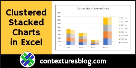
In Excel, you can create a Stacked Column chart, or a Clustered Column chart, using the built-in chart options. There isn’t a Clustered Stacked Column chart type, but here are 3 ways to create one. There’s a video below, that shows the steps for one method.
What is a Clustered Stacked Chart?
Here is the data we’d like to show in a chart — 2 years of sales per season for each region.

And this is the type of cluster stack chart we’d like to create from that data. The chart should have these features:
- Cluster for each region
- Stack for each year, with a segment for each season

Three Ways for Clustered Stacked Chart
Since there’s no built-in way to make an Excel a Clustered Stacked Column, here are 3 methods for building one:
- Rearrange Your Data
- Create a Pivot Table
- Use a Charting Tool
There’s a quick overview of each method below, and more details on the Create Excel Cluster Stack Charts page on my Contextures site.
1. Rearrange Your Data
Long ago, I learned this trick from Excel chart expert, Jon Peltier. He showed how to rearrange the data, and add blank rows, before creating a chart.
You need to make 3 changes to the data layout:
- Move data for different columns onto separate rows
- Add blank rows where you want columns separated
- Add blank rows at the top and bottom, for spacing
For the sample data shown above, this is the revised data layout
- The 2021 data was shifted down one row
- Blank rows were added
Then, select all the cells from B2:J25, and create a Stacked Column chart, with its Gap Width set to zero.

Video: Rearrange Your Data
This short video shows how to set up your Excel data, with blank rows to space the data, and data on different rows. Then, build the chart, and make a couple of quick formatting changes, to end up with a clustered stacked chart.
2. Create a Pivot Table
If you have the source data for the sales data, you can create a pivot table and pivot chart.
- Create a pivot table, with fields for the chart’s horizontal axis in the Row area.
- Put field that you want to “stack” in the Column area.
- Then, create a Stacked Column chart from the pivot table.
- Set the gap width to about 20%, to make the columns wider.
In this example, Region and Year are in the Row area, with Quarter in the Column area, and Sales in Values
It’s not as nicely “clustered” as the previous chart, but it’s a lot quicker to make!

This video shows the steps for building a clustered stacked column pivot chart. For the written steps and sample Excel file, go to the Cluster Stack Pivot Chart page on my Contextures site.
3. Excel Charting Tool
If you need to make this type of clustered stacked chart frequently, or other custom Excel charts, you can save time by using an Excel add-in.
Go to the Peltier Tech website (affiliate link), and check out Jon Peltier’s Excel charting utility.
Jon’s charting utility can help you create complex Excel charts, quickly and easily – much faster than building the charts yourself, from scratch.
Get the Sample Files
For more details, and to get the sample files for methods 1 and 2, go to the Create Excel Cluster Stack Charts page on my Contextures site.
The zipped sample files are all in xlsx format, and they don’t contain any macros.
_____________________
3 Ways to Create Excel Clustered Stacked Column Charts
_____________________

