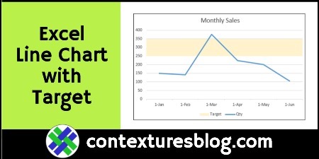
See how to create a simple Excel line chart for monthly sales data. Next, add a target range in the chart, to show which months’ sales fall within that target range.
Line Chart with Target Range
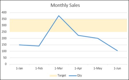
In a line chart with monthly sales data, you can add a shaded target range, behind the line. That will give you a quick indication of which months didn’t fall within the expected range.
You can see all the steps for setting up this chart, in the video below, and get the sample file on my Contextures website.

Video: Line Chart Shows Target Range
This chart shows the steps for setting up the line chart, with the shaded target range behind the line.
There are brief notes below the video, and detailed written steps on my Contextures website.
Set Up Line Chart with Target
Here is a quick overview of the steps for setting up the line chart, and showing a target range for the sales data.
- In worksheet chart data, add minimum and maximum amounts for target range
- Create a formula, to calculate difference between min and max
- Create a stacked column chart from some of the chart data
- Change the sales amount series to a line chart
- Format the 2 target range series
There are brief notes on these steps below, and there are detailed written steps on my Contextures website.
Worksheet Chart Data
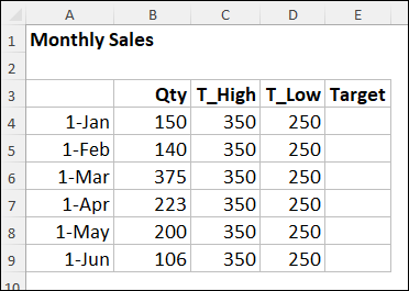
Here’s a screen shot of the simple chart data used in this example.
- The original chart data is in columns A and B
- In column C, I entered a maximum amount for the target range
- In column D, I entered a minimum amount for the target range
Formula for Target Range
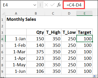
Next, in column E, I added a formula to calculate the difference between the high and low target amounts.
Here is the formula in cell E4, and copied down to row 9.
- =C4-D4
Start with Stacked Column Chart
The next step is to select most of the worksheet data – don’t include the T_High data in your selection.
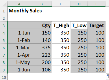
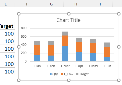
Then, insert a stacked column chart, based on the selected chart and target data.
Line Chart for Sales Quantity
The monthly sales quantities should be in a line chart, so change the chart type for that series only.
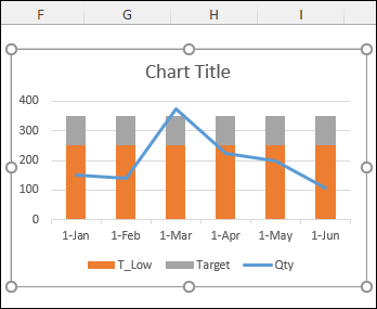
Format the 2 Target Range Series
The T_Low series (orange) is “holding up” the target series (grey), so we can’t remove it from the chart.
However, it can be hidden, by changing its fill colour and border colour to “None”
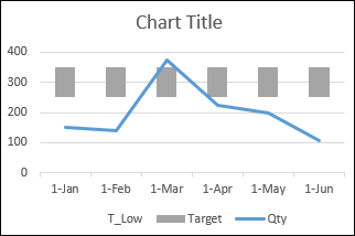
Next, to make the Target series look like a solid block, change its gap width setting to 0%.
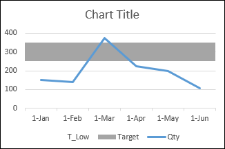
Add Finishing Touches
No Excel chart is complete if you don’t spend time on finishing touches!
For this chart, I did the following:
- linked the chart title to cell A1 on the worksheet, to pick up that heading text.
- changed the target series fill colour
- removed the T_Low series from the chart legend
I’m sure there are a few more things that would enhance the chart, but that’s enough for now!
____________________
Excel Line Chart Shows Target Range for Monthly Sales
_________________


Would it be simpler/easier to plot the stack as just two data points on an invisible secondary axis (no lines, ticks, or labels) rather than repeating the high/low limits and calculation for every data point of the line? You’d still note the high and low of the range, but only once, and with only one difference calculation. That way you’d only have to change one or two values in order resize or shift the target range.
Thanks, David, and you’re right – that would be simpler if all months have the same targets.
I set this up with targets for each month, to handle seasonal variations, if needed.
Ah yes, if it’s not always expected to be a single consistent band, then multiple target values would be necessary.
Dear Mam, 17/6/2022.
I appreciate efforts for Excel Notes and Tips.
Personally those Tips are useful for me.
Hope to receive more and more notes in future too.
Once again thanking you.
Kanhaiyalal Newaskar.