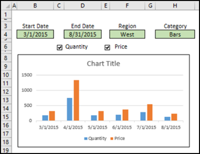
If you add a chart to a dashboard, it’s helpful to let people choose what they’d like to see in the chart. In this example, you’ll choose a date range, and select other criteria, and the interactive Excel chart automatically adjusts to show total values for the selected data.
Interactive Excel Chart – Set Data Range
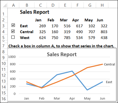
In an earlier tutorial, I showed how to use check boxes to show or hide chart data for specific regions. That chart always showed 6 months of data, but you could show East, Central or West regions.
That example was based on a technique that I learned from Jon Peltier, whose Excel charting tools can make your life easier, if you build charts too.
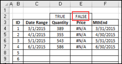
If a series isn’t selected, its data shows #N/A, and that doesn’t appear as a line in the chart.
A New Interactive Excel Chart
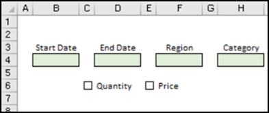
My new interactive chart has check boxes too, and uses that #N/A technique, so you can show the Quantity or Price or both series. It also lets you select dates and criteria, and creates totals from the source data, based on your selections.
The chart is described briefly below, and all the details are on the Excel Interactive Totals Chart page on my website.
Interactive Excel Chart – Dynamic Date Range
Instead of using a set range of cells for the chart data, the new chart uses a dynamic date range. Enter a start date and an end date, and formulas show that list of months.
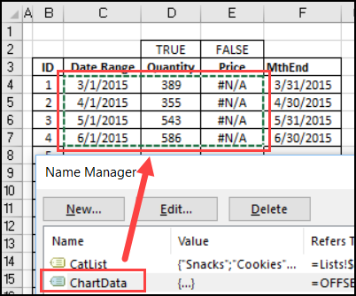
An OFFSET formula is used to define that ChartData range, so it automatically expands or contracts when you change the start or end date.
=OFFSET(ChartStart,1,0,COUNT(ChartDatesALL),3)
Other Chart Criteria
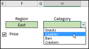
There are drop down lists above the chart, where you can select a Region and Category.
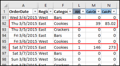
In the table that has the sales data, additional columns were added, to calculate Quantity and Priced, for the rows that match the selected criteria.
Calculate the Chart Totals
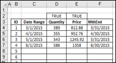
On the Chart Data sheet, where the selected date range is listed, there are formulas that total the calculated Quantity and Price. For example, this formula is in cell D4, to get the total quantity for the first month in the date range.
=IF($C4=””,””, IF(D$2=FALSE,NA(), SUMIFS(Sales_Data[CalcQty], Sales_Data[YrMth],C4)))
In cell E4, a similar formula get the total for calculated price, and shows #N/A, if the Price check box is not checked.
Make a Dynamic Chart
A Clustered Column chart was created first, using the static range C3:E7. Then the chart data range was changed to the dynamic named range, Chart Data. 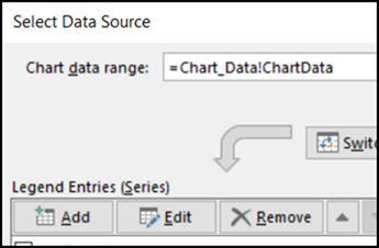
After that, the series and the date labels were changed, to use their dynamic ranges, instead of static ranges. All the details are on the Excel Interactive Totals Chart page on my website.
Add Chart Titles
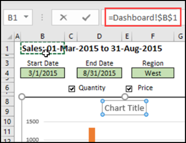
If you plan to print the chart on its own, you can add a chart title that shows the selected date range, and other criteria. In this example, there is a formula in cell A1, and the chart title is linked to that cell. Text boxes are linked to the two criteria cells, to show those selections.
Get the Interactive Excel Chart Workbook
All the details for building this chart are on the Excel Interactive Totals Chart page on my website. On that page, you can download a file that has the data only, so you can build from scratch. Or, download the completed workbook, to see how the interactive Excel chart works.
_____________________

