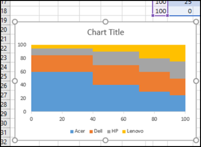
In a Marimekko chart, the column widths show one set of percentages, and the column stacks show another set of percentages. For example, show the size of market segments for computer sales, and company sales within each segment. See how to build a Marimekko chart in Excel, either manually, or with an add-in.
How to Build a Marimekko Chart
Excel doesn’t have a Marimekko chart type, but you can create your own version, with these steps:
- carefully rearrange your data
- add a list of percentages for the axis
- build a Stacked Area chart
It takes a bit of time, but doesn’t require macros or complex formulas. There’s a quick overview below, and you’ll find detailed steps on my Contextures website.
Create Whole Numbers
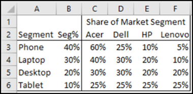
Here’s the original data that’s been summarized for a Marimekko chart. It lists the market segments at the left, with the percentage for each segment. There are company names across the top, and the percentage per company within each segment.
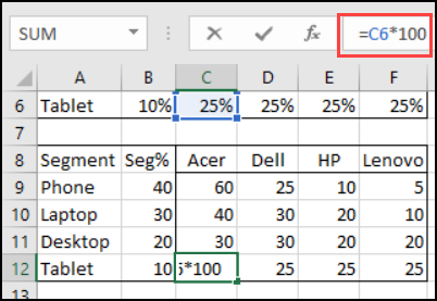
For this Marimekko technique, we need the data in whole numbers, instead of percentages.
I created a second table, linked to the first, with each number multiplied by 100, and formatted as General.
Rearrange the Data
Next, you’ll create a chart data table:
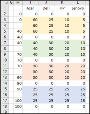
- Data for each segment is copied and pasted 3 times. This will create a “steps” effect in the Marimekko chart, with left, centre, and right points.
- Between the groups of segment data, you’ll add rows of zero values. This created vertical lines that divide the segments
- You’ll build a list of cumulative segment percentages at the left, to mark where each segment begins and ends.
Mark the Segment Centres
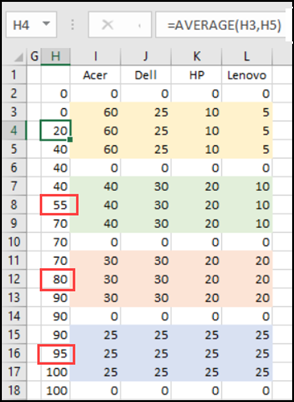
To complete the data, you’ll fill in the midpoint for each set of segment data. For example, the Phone segment goes from 0 to 40, so 20 would be at the centre of that data block.
You can do the arithmetic in your head, and type in the values, or use the AVERAGE function. For example, in cell H4: =AVERAGE(H3,H5)
Here is the chart data with the segment midpoint rows filled in.
Create a Stacked Area Chart
Once the data has been set up, follow these steps to build a Marimekko chart:
- Select the chart data and headings — cells H1:L18
- Insert a Stacked Area chart
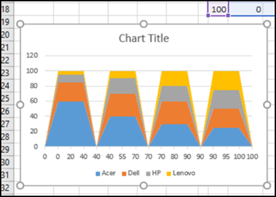
The chart doesn’t look quite right, but you’ll fix that in the next step.
Fix the Chart
At first, chart shows flat-topped triangles, instead of “steps”. That’s because the percentages for the Category axis are being treated as text.
To fix the chart:
- Right-click the X Axis, and click Format Axis
- Under Axis Option, select Date Axis as the Axis Type
- For the Major and Minor Units, type 20, and select Days
- Click on the Y axis, to select it
- In the Bounds section, set the Maximum to 100
- Close the Format Axis pane
The chart changes, to show the Marimekko “steps”.
Complete the Marimekko Chart
To complete the chart:
- Remove the default Chart Title, or change its text. I changed it to “Computer Sales” in this example.
- Add a light border to each series, to make a visual separation between the blocks.
- Insert a text box at the top of each segment, with the segment name.
NOTE: Instead of text boxes, you can add a list of label points and label text, at the right side of the table. Then, add that series as a line chart, and use Rob Bovey’s free Chart Labeler add-in to label the points. There is an example in my sample workbook, that you can download.
Quick and Painless Marimekko Chart
If you don’t have the time or patience to arrange your data and create your own Excel Marimekko chart, check out Jon Peltier’s Excel Chart Utility. This Excel add-in has a Marimekko feature, so it only takes a few seconds to build the chart. This short video shows how easy it is.
There are several other custom chart types in Jon’s Excel Chart Utility, including Waterfall, Stacked Waterfall, Cluster Stack, Histogram, Box Plot, Dot Plot, and Pareto.
The tool also includes a Loess data tool, and other time-saving chart management and formatting tools, such as Export Chart, and Label Last Point.
Download the Workbook
To see how the Marimekko chart is created, and to get the detailed instructions, go to the Marimekko chart page on my website. Scroll down to the Download section, and click the link to get the workbook. The zipped file is in xlsx format, and does not contain macros.
_______________________


