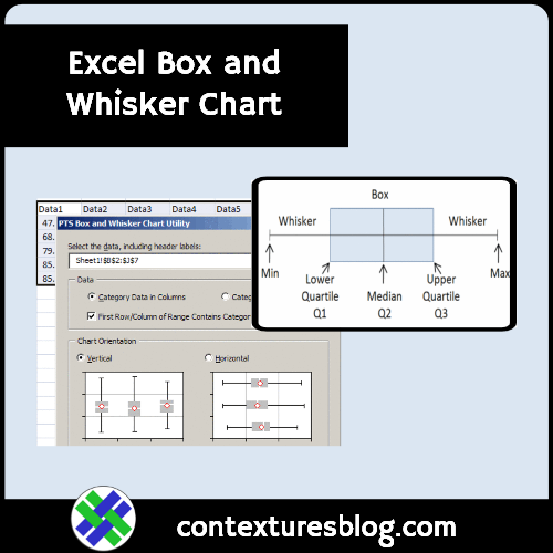
What the heck is a box and whisker chart, and why would you need one? Well, I’m not a statistician, but here’s my overview.
Continue reading “Make Excel Box and Whisker Chart-Box Plot Chart”
Excel tips and tutorials

What the heck is a box and whisker chart, and why would you need one? Well, I’m not a statistician, but here’s my overview.
Continue reading “Make Excel Box and Whisker Chart-Box Plot Chart”
Children around the world can learn how to make shiny 3D pie charts, thanks to the Create a Graph page on the National Center for Education Statistics (NCES) web site.
See more about those charts below, and we’ll take a look at a Hey Scale chart too!
If you’ve created several reports in an Excel workbook, you might want to line them up and make them all the same size before printing.
Instead of doing this manually, you can download and install Jon Peltier’s free Align Chart Dimensions utility.
There are installation instructions on Jon’s site.
After you install the add-in, you can select specific charts, or let the utility align all the charts on the sheet.
Check the options to align and resize the charts, then click OK, and your report is ready.
