
Children around the world can learn how to make shiny 3D pie charts, thanks to the Create a Graph page on the National Center for Education Statistics (NCES) web site.
See more about those charts below, and we’ll take a look at a Hey Scale chart too!
What is a Hey Chart?
Have you ever heard of a Hey Chart or the Hey Scale? It was new to me, and here’s what I found out, and how I built one in Excel!
In a Hey Scale, you count the number of Ys, if someone types “Heyy” in a text message. The higher the number, the more that person likes you (sometimes).
Hey Chart in Excel
In the screen shot below, I made an Excel table, with ratings based on the number of Ys.
Tip: You could type different rating messages in your list, or use different numbers in the scale.

Hey Chart Formulas
On the same worksheet, there’s a cell (B3) where you can type “Hey”, with as many Ys as you’d like.

After you type the word “Hey” in that yellow cell, a formula in cell B5 counts the number Ys that you used.
- =LEN(B3)-LEN(SUBSTITUTE(B3,”y”,””))
Here’s how that formula works:
- First, the formula counts the number of characters in the yellow cell.
- Then it subtracts the number of characters in that word, after you remove all the Ys
Find the Matching Rating Message
Below that, in cell B7, a VLOOKUP formula shows the rating message, based on the number of Ys.
- =IFERROR(VLOOKUP(B5,Table1,2,TRUE),”Try again”)
The IFERROR message shows “Try again”, if there is a problem with the VLOOKUP.
Get the Hey Scale Workbook
If you’d like to try this for yourself, you can download my sample Excel workbook.
The zipped file is in Excel’s xlsx format, and the workbook does not contain any macros.
NCES Create a Graph
And now, as promised, here’s more information about the NCES and its Create a Graph page.
- The NCES is part of the U.S. Department of Education and the Institute of Education Sciences, and collects and analyzes data related to education.
- The NCES site has a Create a Graph page, which has a charting tutorial, and advice on selecting a chart type.
Get Started
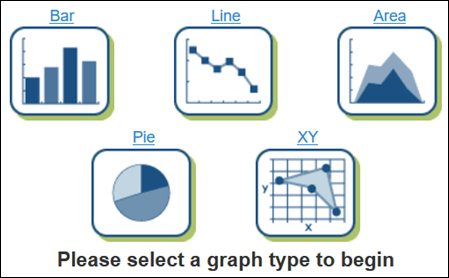
To create a graph, you’ll start by choosing a chart type. There are 5 chart types available: Bar, Line, Area, Pie and XY
If you aren’t sure which chart type to choose, click the link to the Chart Tutorial. It explains which chart types work best with different types of data.
Choose Design Settings
After you select a chart type, that chart’s icon goes to the top of the page.
A set of tabs appears at the right side of the screen: Design, Data, Labels, Preview, and Print/Save.
At first, the Design tab is active. There are different settings available for each chart type.
I selected a pie chart (here’s how to make one in Excel), and left the default settings as they were.

Add Your Data
Next, click the Data tab at the right, and enter some data for your chart.
You can add a chart title too, and the source for your chart data.
I left the default colours for the pie slices, but went back later, and changed them to lighter shades.

Customize the Labels
Next, click the Labels tab at the right, and choose the label options that you want.
I went back to this tab later, to change some of the settings. The font sizes were too small.

Preview the Chart
While you’re building the chart, you can see how it looks, based on your current settings.
- At the bottom of the page, click the Update button,
- Then click the Preview tab, at the right side of the screen.
Here’s my completed pie chart, after I changed several of my settings. The original pie slice colours were too dark, and the font was too small.

Also, I removed the legend, after adding the chart labels.
Don’t Follow the 3D Examples
This was a fun and informative tool to use, and I think kids would enjoy using it
The only thing I didn’t like was in the chart tutorial, where several of the example charts had 3D effects, which can distort the chart data.
For example, here’s a 3D pie chart from the tutorial. The slice for Weather looks extra big, because of the tilt in the 3D effect.

And even worse was this 3D column chart monstrosity. Kids, don’t try this at home!
 NCES Kids’ Zone
The Create a Chart page is part of the NCES Kids’ Zone which links to information (Educators’ Corner and School Search), and other fun activities. So, when you’re tired of making fancy charts, try something else!
On the main page of the Kids’ Zone, click on one of the other Activity circles, to see the options for that category — Test Your Knowledge, Games, or Dare to Compare, where you can test your knowledge against that of grade school students.
Are you smarter than a 4th Grader? I’m proud to announce that I got all of the Grade 4 math questions right. Whew!
