
Did you know that you can create waterfalls in Excel — Waterfall Charts? We have a very famous waterfall here in Canada, which you can see in the photo below from our fall vacation, a couple of years ago.
Category: Excel charts
Excel Box Plot Chart-Airport Security Times
 Earlier this month, I had the pleasure of flying out of Chicago’s O’Hare airport. I was checking in at the ungodly hour of 6 AM on a Sunday, and hoped that would be a quiet time at the airport.
Continue reading “Excel Box Plot Chart-Airport Security Times”
Early Charts – Business Graphics 1982
“In the back of my mind, I always knew that charts would help me,” says the market researcher in this promotional video from 1982. Wow, did you really have to wait weeks for your data processing department to make your charts, back in the old days?
Leno and Conan Excel Gantt Chart
Rumours say that the late night TV schedule on NBC will change. Jay Leno will leave his 10 PM spot, and return to 11:35 PM. How long will the revised Leno show be, and what effect will it have on the rest of the schedule?
I’ll bet the NBC programming executives have set up an Excel worksheet to test the possible scenarios, and they made a nice Gantt chart to show the results.
What Is Polar Chart in Excel
Have you ever made a Polar Chart in Excel? Or are you like me, and only have a vague idea of what a Polar Chart is (or no idea at all)?
I’ve made thousands of Excel charts over the years, but never made a Polar Chart.
Excel Add-In for Polar Charts
Excel MVP, Andy Pope, has just released a new version of his free Polar Chart add-in, and here’s an example of the charts it can create.
Grocery Store Charts and Other Signs
This week I was travelling, and signs are really important for helping you figure out where you are, and where you should be headed.
Whether you’re posting street signs, retail signs, or worksheet instructions, try to make them clear and helpful.
Continue reading “Grocery Store Charts and Other Signs”
Excel Smiley Face Chart-Interactive Adjustable
A few years ago, I added a sample workbook on my site, that features an adjustable Smiley Face Chart.
Type a number between 0 and 100, and the mouth changes from a smile to a frown, based on the score.

Score Cell Data Validation
The Score cell, H3, has data validation, to ensure that users enter a valid number.
Below, you can see the data validation settings that are used in the Score cell.

When you change the value in the Score cell, the Worksheet Change event code runs, and changes the curve of the mouth. You can see the code in the next section of this article.
A couple of years ago, John Walkenbach announced his scientific breakthrough in Smiley Chart development, using a scatter chart to create the smile.
I remained loyal to my version though, and it has served me well over the years.
Using the Smiley Chart in Excel 2007
The Smiley Face chart is still very popular, and is downloaded hundreds of times every month. So, I opened it in Excel 2007 recently, and was surprised to find that it didn’t work correctly. I changed the score, and nothing happened.
First, I made sure that I had enabled macros, because the event code needs to run when the code is changed. Sometimes it’s easy to overlook that Security warning, just above the Formula bar.
Macros were enabled, so that wasn’t the problem. Eventually, I figured out that the degree settings for the smile are different in Excel 2007, so I added a new page to the sample workbook, using those settings.
Why did the setting change? I have no idea. Anyway, here’s the code, showing the minimum and maximum settings, for both Excel 2007 and Excel 2003.

Download the Smiley Chart Sample File
You can download the zipped Smiley Chart sample file from my Contextures site. On the Sample Files page, look for DV0018 – Happy Face Gauge.
__________
What Is a Waterfall Chart and Why Would I Need One
Last month your revenue was $40,000 and this month it’s only $30,000? What happened? In Excel, you could print a nice report that shows each revenue stream for last month and this month, so you can compare the amounts.

You could even create a bar chart to compare the different revenue streams.

The bar chart lets you see the differences for each stream, but maybe you’d like to see how each revenue stream contributed to the overall change in revenue.
A waterfall chart will let you see the changes that occur between a starting point and an ending point. In Excel, you can create a waterfall chart by building a column chart, and making some changes to it.
Create a New Table
The first step in building a waterfall chart is to create a table that calculates the individual changes, and a running total. In the example below:
- June and July revenues are at the far right.
- F3 is the total for June.
- C9 is the total for July.
- Column D shows the difference, where amounts have gone down.
- Column E shows the difference, where amounts have gone up.
- Column B is the running total, from the June start, to the July end.

Add a Column Chart
To start the waterfall chart, select the range in the thick border (A1:F10), and insert a clustered column chart.

Hide the Running Total
To focus on the revenue stream changes, you can hide the series for the running total:
- Click on a dark blue column, to select the Run Ttl series
- On the Ribbon’s Format tab, for Shape Fill, select No Fill
To remove the Run Ttl series from the legend:
- Click on the legend to select it
- Click on Run Ttl, then press the Delete key

Format the Waterfall Chart
Next, you can add a bit of formatting to make the column chart look more like a traditional waterfall chart. To widen the columns:
- Right-click on any column, and click Format Data Series.
- In the Series Options category, set the Gap Width to 0%.
- Close the dialog box.

To lighten the gridlines:
- Right-click on a gridline, and click Format Gridlines.
- In the Line Color category, select Solid Line.
- From the Color drop down list, select a light shade, such as the lightest grey.
- Close the dialog box.
In this revenue chart, up is good, and down is bad, so you can change those series colors to red and green. If the End series is red, change it to a different color, to avoid any confusion. To change a series colors:
- Click on a column, to select its series
- On the Ribbon’s Format tab, for Shape Fill, select the color you want
And here’s the finished waterfall chart. I also added data labels with a custom number format, to show up and down arrows.

Waterfall Chart Utility
The example shown here is a very simple waterfall chart, with only a few changes. If you need to make lots of waterfall charts, or more complex charts, you should invest in Jon Peltier’s Excel Chart Utility.
To use the utility for the revenue stream data, you could set up a simple table that showed the start and end amounts, and the change in each revenue stream. These are just links to the original table, that had monthly revenue and the change amounts.

When you install the Chart utility, it adds a Waterfall command to the Ribbon. Select a cell in the table, then click the Waterfall Chart command, to open the dialog box.

You can change the sort order, and the option to use values as data labels, or go with the default settings. Then click OK, and the chart is created and formatted instantly. Much quicker and easier than doing everything manually!

So, to save yourself some time and headaches, take a look at Jon Peltier’s Excel Chart Utility. Use it to create waterfall charts, and other custom charts. It’s very reasonably priced, and will quickly pay for itself, in time saved.
________________
Problems With Dynamic Charts in Excel
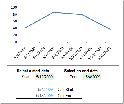
Recently, I wrote about creating dynamic charts in Excel, where you can select a date range from drop down lists. In that article I warned that the dynamic values would disappear if the entire range is selected, in Excel 2007.
I’ve done more testing, to see when the values stick, and when they disappear, and there’s a new version of the file for you.
Compare Annual Data in Excel Clustered Stacked Chart
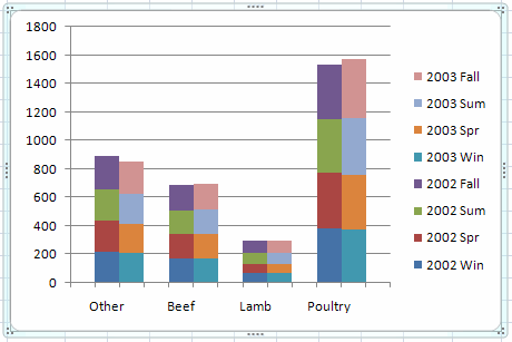
How can you create a chart from annual or monthly data, and make the results easy to understand? See how to compare annual data in Excel Clustered Stacked Chart — like a clustered column chart, but with stacked columns, instead of normal ones.
Continue reading “Compare Annual Data in Excel Clustered Stacked Chart”