Have you ever made a Polar Chart in Excel? Or are you like me, and only have a vague idea of what a Polar Chart is (or no idea at all)?
I’ve made thousands of Excel charts over the years, but never made a Polar Chart.
Excel Add-In for Polar Charts
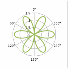
Excel MVP, Andy Pope, has just released a new version of his free Polar Chart add-in, and here’s an example of the charts it can create.

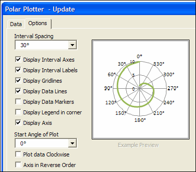
Andy’s add-in looks intriguing, and he carefully explains how it works, and describes all the option settings.
You can download the add-in for Excel 2007 or Excel 2003, and there’s also a sample workbook with data.

No General Info on Polar Charts
However, Andy has created this add-in for people who already know what a Polar Chart is, and what it’s used for.
The only clue as to what a Polar Chart does is in Andy’s description of the data:
- “The data layout should be angles in first column with adjacent columns containing distance data for each series you which to include in the plot.”
There are a few links at the bottom of the add-in page, that lead to other pages on building polar charts. However, those pages don’t tell me what a Polar Chart is, or when I’d need one.
What Is a Polar Chart?
So, I headed off on my own Polar expedition. Google pointed me to Wikipedia, which has a lengthy article on Polar Coordinates.
The main thing I learned was that I should have paid more attention in my math classes. But it did explain this:
- The fixed point…is called the pole
- the ray from the pole with the fixed direction is the polar axis
- The distance from the pole is called the radial coordinate or radius, and
- the angle is the angular coordinate, polar angle, or azimuth.
And there was a link to another page, which has an interactive example of Polar Coordinates.
The page is part of the Scratch program, from the Lifelong Kindergarten group of the MIT Media Lab. As you move your mouse over the graph, it displays your angle and distance.
When Would You Use a Polar Chart?
Now that I understand the basics of what a polar chart is, I’d like to see some examples of how and when they’re used.
Wikipedia says they can be used to display things like groundwater flow, gravitational fields, a microphone’s pickup pattern or radio antennas.
So, if you’re not an engineer, you probably don’t need to use a Polar Chart. But, if you’d like to learn a bit more, there are some pages to explore, in the next section.
Polar Chart Examples
1-I found a few examples of Polar Charts being used when measuring vibrations in aircraft, including this paper from the US Army. Apparently, the goal is “to calculate and apply rotor adjustments such that the data points will move as close to the center (zero vibration) as possible.”
2-This website on wireless training uses Polar Charts to analyze radio transmissions.
3-This page has a polar temperature chart, and I think it covers both meanings of Polar. It’s a Polar Chart type, and shows temperature at the North Pole.
4-This page on Graphing Polar Equations shows sample data, and you can even download free polar graph paper! That would be handy when you don’t have a copy of Excel available.
And in an interesting side note, while researching Polar Charts, I learned that Florence Nightingale invented Pie Charts.
Any Other Polar Chart Pages?
If you know of any other websites that have Polar Chart information, please let me know in the comments. Thanks!
____________

Thanks for the mention Debra 🙂
Not explaining what or how to use a polar plot was a big over sight on my behalf.
I will, if I may, make use of your research and add some explanation to my page.
You’re welcome, Andy, and thanks for sharing your Polar Chart add-in. Please use any of this research that you’d like, and I’m sure you can explain things more clearly than I did. 🙂
Florence Nightingale didn’t invent pie charts, William Playfair did, back in the previous century (he also invented bar charts). She didn’t invent the polar area chart shown in that link either, that was her friend the Belgian statistician Adolphe Quetelet. But she was the first woman to be elected a Fellow of the Royal Society of Statisticians, or the body that would become the Society.
As Stephen Few states in “Now you see it” (p. 15):
“Playfair invented the bar graph, was the first to use line graphs to represent change through time, and, on one of his off days, invented the pie chart.”
Don’t forget Stephen Bullen’s polar chart example from February 1998:
http://www.oaltd.co.uk/DLCount/DLCount.asp?file=FunChrt6.zip
This chart shows how to create polar plots in Excel.
Thanks derek and Jon! It did seem odd that I’d never heard that before. Maybe you should send a nice note to the Florence Nightingale Museum people.
And thanks for the link Jon, I’ll add it to the list.