
Last week, I heard from someone who was having a problem sorting some numbers in Excel. He sent me a small sample file that showed a few of the dates and numbers that just wouldn’t sort correctly.
My first guess was that the data had been copied from a website – that can cause some strange behaviour, when you paste it into Excel. A quick check with the COUNT and COUNTA functions showed that none of the values in cells C3:C6 were real numbers – they were text.
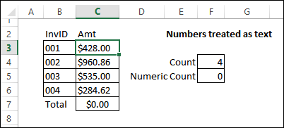
Continue reading “Excel Numbers Do Not Sort or Add Correctly”

 It’s almost Halloween, and perhaps you’re familiar with the horror story that I’m about to tell you. It’s a frightening tale of an Excel workbook that was destroyed forever, by a well-intentioned, but easily-distracted genius.