Did you ever print and distribute pivot table reports in Excel, only to discover – too late – that they weren’t showing the correct information? To help save you from wasted time and paper, and possible embarrassment, AlexJ is sharing his Report Diagnostic Display technique today.
You might remember some of his other handy tips, such as
Multiple Reports and Slicers
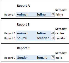
AlexJ sends out several monthly reports that are pivot tables, all based on the same source data. Each pivot table is on a separate sheet, and each one has a unique layout and filters.
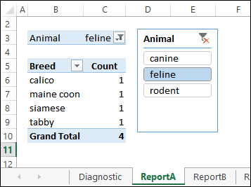
We’ll use a simpler version for this example, with 3 reports and a diagnostics sheet. In the screen shot below you can see Report A, and its Slicer for the Animal field.
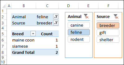
Report B is slightly different and has 2 Slicers – Animal and Source.
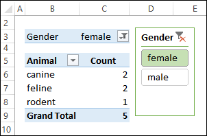
The final report – Report C – has one Slicer, and a different layout.
Record the Setpoints
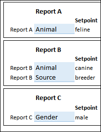
To create a standard set of reports each month, AlexJ needs to have specific items selected in the Slicers for each report. He created a master list of these settings, and typed them onto the Diagnostics sheet in the workbook, as Setpoints.
Show the Current Selections
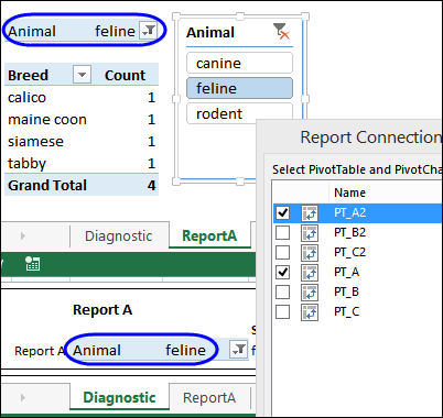
To avoid going to each sheet every month, and checking its pivot table Slicers, AlexJ put a copy of each pivot table onto the Diagnostics sheet. Then, he removed all the fields, except the Report Filters. All that’s left is a tiny pivot table, that almost looks like a regular data validation drop down list.
The pivot tables on the Diagnostics sheet are connected to the same Slicers that are on the Report sheets, so their filters show the same selections.
Find the Mismatched Filters
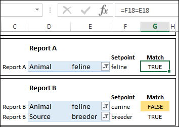
With the current selections and the Setpoints on the Diagnostic sheet, it’s easy to identify the reports where the incorrect filters are selected.
For example, the formula in cell G18 compares the selection and Setpoint in Report A: =F18=E18
Those items are the same, so the result is TRUE. However, in Report B, there is a mismatch in the Animal field, so the result is FALSE. Conditional formatting highlights the cells that contain FALSE.
Show a Diagnostic Summary
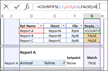
To show a quick summary of the report status, there is a Reports list at the top of the Diagnostics sheet. It uses a COUNTIFS formula, to check the number of FALSE matches for each report. The formula in cell G10 is:
=COUNTIFS(C:C,D10,G:G,FALSE)=0
Count the Ready Reports
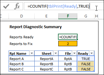
Finally, there are two formulas at the top of the sheet, to count the number of TRUE and FALSE results in the Reports List.
The formula in cell F5 counts the TRUE results, and F7 counts the FALSE results.
=COUNTIF(tblPrint[Ready],TRUE)
Fix the Report Before Printing
Before printing the reports, you can use the pivot tables on the Diagnostics sheet, to correct any mismatched selections.
For example, in Report B, select canine from the Animal field, to match its Setpoint.
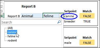
Then, after all the reports have been fixed, you can go ahead with the printing.
Download the Sample File
To download the file, go to the Check Pivot Filters Before Printing page on my Contextures website.
The zipped file is in xlsx format, and does not contain any macros.
_____________________
