See Formulas on Excel Worksheets

Last week I was testing a client’s workbook, and had filled in all the data entry cells, to make sure everything was working correctly.

Find Data Entry Cells

Before sending the workbook back to my client, I wanted to clear all the data entry cells.

Instead of selecting each cell individually, and clearing it, it would be easier to clear groups of adjacent cells where possible.

However, some cells had formulas, and I didn’t want to accidentally clear any of those.

If the formulas are visible, that would prevent the problem.

See Formulas in Excel 2003

If you’re using Excel 2003, follow these steps to see the formulas on the worksheet:

  • On the Tools menu, click Options
  • On the View tab, add a check mark to Formulas.

FormulaShow01

See Formulas in Excel 2007

If you’re using Excel 2007, follow these steps to see the formulas on the worksheet, instead of the formula results:

  • Click the Office button, then click Excel Options
  • Click the Advanced category
  • In the Display Options for This Worksheet section, add a check mark to
    • Show formulas in cells instead of their calculated results.

FormulaShow02

Show or Hide Formulas with a Keyboard Shortcut

The keyboard shortcut to show or hide the formulas is

  •  Ctrl + ` 

The symbol at the right is an accent grave, and that key is above the Tab key on the my laptop’s keyboard. It might be in a different location on yours

The accent grave looks similar to an apostrophe, but its top leans to the left, instead of being straight up and down.


___________________

Create Tableau Chart From Excel Data

Last month, I wrote about Tableau dashboards, and my first experiences with creating a Tableau workbook from Excel data.

In this post, you’ll see another sample dashboard, where you can experiment with the user controls.

Select one or more days of the week, or highlight a sales representative.

Tableau Dashboard

Here’s a screen shot of the Tableau dashboard, that focuses on Parts sales for each sales representative.

You can see the sales amounts per day of the week, average price compared to quantity sold, and the top three sales reps for parts.

To try the interactive features, go to the dashboard on the Public Tableau site.

Interactive Tableau dashboard

Make Dashboards in Excel

You can make fancy, interactive dashboards in Excel too! For examples, tips, videos and ideas, go to the following dashboard pages on my Contextures site:

Dashboard Course Review – A detailed review of Mynda Treacy’s online Excel Dashboard course, which she opens 3-4 times each year, on her website.

Dashboard Problems Survey Results – I ran a survey, to ask if people used Excel Dashboards – Yes or No, and what problems they encountered. The detailed results and replies are shown on this page

Dashboard Templates– This page has sample Excel dashboard templates that you can download, to help you get started, or add new features to your existing dashboards

Dashboard Tips – These examples show common Excel dashboard mistakes, and how to fix them

_________________

Show Total Hours in a Pivot Table

In an Excel file, you might record the time that employee work on specific projects. For example, an employee worked on Project A for 8 hours Monday, 8 hours Tuesday, 6 hours Wednesday and 3 hours Thursday, for a total of 25 hours. Later, you can show total hours in a Pivot Table.
Continue reading “Show Total Hours in a Pivot Table”

Hide Duplicate Headings in Excel Report

A few weeks ago we looked at a way to fill blank cells in an Excel report, so you’d be able to filter or sort a table of data.

The downside of that technique is that it’s harder to pick out the sections in a report. The headings don’t pop off the page — they’re buried in a long list of items.

Continue reading “Hide Duplicate Headings in Excel Report”

Move Excel Data With Advanced Filter No Macro

In Excel, you can automatically copy data from one sheet to another, without using a macro.

For example, there’s a long list of orders on one worksheet, and you’d like to find your largest orders, and copy those to a different worksheet.

Continue reading “Move Excel Data With Advanced Filter No Macro”

Create List of Names In Excel Workbook

Well, I finally finished creating all the names in my client’s Excel workbook, and sent the file back to them.

To help my client see what I’d done, I created a list of the names in the workbook, and sent it along with the main file.

It was also a quick way for me to double-check the names and their formulas.

Create the List of Names

Here are the steps to create a list of names:

  • Insert a new worksheet, or select a cell in a blank area of an existing worksheet. On the Ribbon, click the Formulas tab.
  • In the Defined Names group, click Use in Formula

Excel Name Use in Formula

  • At the bottom of the list of names, click Paste Names (In Excel 2003, click Insert | Name | Paste)

Excel Name Paste Names

  • In the Paste Name dialog box, click Paste List.

Excel Name Paste Name

A 2-column list of names will be inserted, starting in the selected cell, so make sure you have room for your list.

Excel Name List on worksheet

What’s in the List?

The list of names will contain all the workbook level names, unless there’s a duplicate sheet level name on the sheet where the name list is pasted.

In that case, the sheet level name appears in the list, instead of the workbook level name.

Name Manager Add-In

I’ve mentioned Jan Karel Pieterse’s Name Manager before, as one of my favourite Excel add-ins.

If you’re working with names, in any version of Excel, you should download and install it. It’s free, easy to install, and simple, but powerful, to use.

You can download Name Manager for Excel 2007 or earlier versions.
______________

Quickly Create Excel Names From Labels

This week I’m working on a giant Excel workbook, and my client wants all the data entry cells named.

There are about 600 cells to name, so I’m looking for ways to same some time.

Use the Name Box

A quick way to name a cell is to click in the Name Box, type the name, the press the Enter key.

In the screen shot below, cell C4 is being named as FullName.

Type name in Name Box

Create From Selection

Even quicker is to use the Create Names feature, and name the cells based on the labels in adjacent cells .

Here, the cells with labels, and the data entry cells, are selected (B4:C8).

Select Labels and Cells

Ribbon Command

Then, on the Ribbon, click the Formulas tab

Next, click Create From Selection.

  • Or, in Excel 2003, click Insert | Name | Create.

Create From Selection

Create From Selection dialog box

In the Create From Selection dialog box, select the location of the labels.

In this example, the labels are in the left column of the selected cells.

Then click OK to create the names.

Create From Selection dialog box

Name a Range of Cells

In this example, I named a single cell with each label. You can select multiple cells adjacent to each label, and the label will name the range of cells.

Valid Characters in Names

If the labels contains spaces, they’re replaced with an underscore.

Underscore in Created Name

Other invalid characters, such as ampersand ( &  ) and hashtag / pound sign (# ) will be removed or replaced by an underscore character.

More Information

For more information on naming cells, go to the Excel Names and Named Ranges page on my Contextures site.
_________________

Excel Smiley Face Chart-Interactive Adjustable

A few years ago, I added a sample workbook on my site, that features an adjustable Smiley Face Chart.

Type a number between 0 and 100, and the mouth changes from a smile to a frown, based on the score.

Excel Smiley Face Chart-Interactive Adjustable

Score Cell Data Validation

The Score cell, H3, has data validation, to ensure that users enter a valid number.

Below, you can see the data validation settings that are used in the Score cell.

Excel Data Validation settings

When you change the value in the Score cell, the Worksheet Change event code runs, and changes the curve of the mouth. You can see the code in the next section of this article.

A couple of years ago, John Walkenbach announced his scientific breakthrough in Smiley Chart development, using a scatter chart to create the smile.

I remained loyal to my version though, and it has served me well over the years.

Using the Smiley Chart in Excel 2007

The Smiley Face chart is still very popular, and is downloaded hundreds of times every month. So, I opened it in Excel 2007 recently, and was surprised to find that it didn’t work correctly. I changed the score, and nothing happened.

First, I made sure that I had enabled macros, because the event code needs to run when the code is changed. Sometimes it’s easy to overlook that Security warning, just above the Formula bar.

Macros were enabled, so that wasn’t the problem. Eventually, I figured out that the degree settings for the smile are different in Excel 2007, so I added a new page to the sample workbook, using those settings.

Why did the setting change? I have no idea. Anyway, here’s the code, showing the minimum and maximum settings, for both Excel 2007 and Excel 2003.

HappyFace02

Download the Smiley Chart Sample File

You can download the zipped Smiley Chart sample file from my Contextures site. On the Sample Files page, look for DV0018 – Happy Face Gauge.
__________

Select Multiple Items from Excel Data Validation List

You’ve probably used an Excel data validation drop down list, where you can click the arrow, and select an item to fill the cell. With a bit of programming, you can customize a drop down list, to select multiple items.

Continue reading “Select Multiple Items from Excel Data Validation List”

Tableau Dashboard Trial Version Test

This summer I helped a client automate several Excel sales reports, comparing sales forecasts to actual sales, and last year’s results to this year’s.

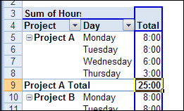
It’s a complicated process, pulling numbers from different systems, updating lookup tables, compiling the numbers, and creating reports by product, by customer and by sales rep.

Before we automated the process, it took one person almost a week to create the reports, and despite all that effort, nobody was happy with the results.

  • The sales reps thought there was too much data to wade through – they wanted to focus on their customers and sales. Were sales on target? Which customers need more attention?
  • The managers wanted to see the big picture, and quickly assess how things were going overall. Were all the brands performing as expected? Which products or customers were growing or declining?

Tableau Dashboard

While working on the reports, I noticed people talking about Tableau dashboards in Twitter. I followed their links, and was really impressed by what I found.

With Tableau, we could quickly connect to the data in Excel, and also link to the lookup tables, so all the prices and descriptions would be accurate and instantly updated.

So, I downloaded a trial version of Tableau, and created some reports from the client’s data. It was really easy to get up and running, creating tables and charts, with quick filters that let me focus on a specific brand, customer, or sales rep.

Next month, when there’s a new set of data, the old file can simply be replaced by the new file (with the same name), and the charts and tables will automatically refresh when the Tableau workbook is opened.

Share the Results

After you create reports in Tableau, you can send out a pdf file, or a Tableau workbook, to share the results.

There’s a free Tableau reader, so recipients can open the workbook file, and adjust all the filters, sliders and other controls that you’ve added to the dashboard.

Each person can analyze the data in a way that’s meaningful to them, and drill down to the details, or step back to absorb the bigger picture.

To give you an idea of what’s possible in Tableau, I’ve created a sample workbook, shown below. Dan G. Murray, COO of InterWorks Inc., generously shared the sample sales data that he used for a presentation at the Tableau Customer Conference this summer.

With Dan’s data, I made a few dashboards, and Elissa Fink, VP Marketing at Tableau, published them on the Tableau Public server.

Try It Yourself!

Here’s the first dashboard in the workbook, focused on sales rep results and country totals. Each sales rep can see their overall total, and total and average sales by country.

The map gives a snapshot of sales location, and clearly shows that large sections of the USA aren’t buying the company’s products. You can experiment with the dashboard controls, and change the way the data is presented. You might have to widen your browser window, to see the full dashboard.

  • There’s a date range selector at the top left of the dashboard. Only the past four weeks of sales results are in the dashboard, but you can select a specific number of previous weeks, or other range, such as previous quarter.
  • At the bottom left of the dashboard, in the Salesman Name list, click the highlighter at the top right, to turn on the Highlight Selected Items feature. Then, click on a Sales Rep name in one section of the dashboard, and that name is highlighted in all the sections.

Dashboard on Tableau: Sales Rep Dashboard
_________________