If you name a range of cells in Excel, you can use that name in a formula, or as the source for a data validation list, or as the data source for a pivot table.
For more than a year I’ve posted Excel related tweets every week, ranging from the hilarious, to the bizarre, to the somewhat useful.
Twitter Search Problems
Lately though, using the search feature in Twitter pulls up long lists of ads, spam, ads, spam, and more spam. To see for yourself, you can search for Excel Spreadsheet in Twitter. Maybe you’ll have better luck than I’m having.
There’s still the occasional nugget of Excelly goodness in the Search page, but I don’t have the time or patience to wade through all the other stuff.
So, I’ll stick to reading what’s in my own Twitter stream, posted by friends and colleagues.
Anyway, I hope you enjoyed the Excel Twitters while they lasted!
A Few Good Things
More good stuff comes from my email and RSS feeds, like these three items from this week.
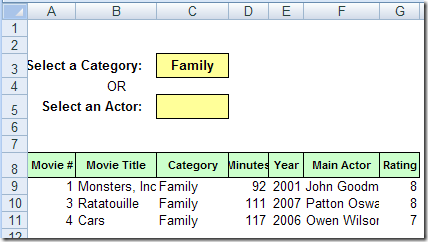
For a simple database, Excel can do a pretty good job of organizing and reporting your data. This example shows a movie collection database in Excel, but you could set up something similar to keep track of books, sales orders, or almost anything else.
Some people like an Excel workbook that’s locked down, so they can’t accidentally mess anything up. They just want to go to the data entry section, put in their data, and get out alive.
Protect or Unlock?
Other people hate Excel workbooks that are protected. Maybe they know a bit more about Excel, and are comfortable making changes.
Or, they’ve been assigned to manage a workbook, and don’t want to bother with worksheet protection, because it slows them down.
Give the Users Control
One of my clients has plants all over the world, and we’ve made a similar data collection workbook for each plant.
On the last sheet of the workbook, I’ve added a drop down list, where the user can select TRUE or FALSE, to lock the worksheets.
select TRUE or FALSE, to lock the worksheets
If the setting changed to FALSE, a macro runs, to unprotect all the worksheets.
If the setting is changed to TRUE, all the sheets are protected.
The TRUE/FALSE option is a quick and easy way for users to control the workbook settings, and seems to be working well.
The Code
There’s code on the worksheet module that runs when the Lock cell’s value is changed. To see the code, right-click on the sheet tab where the drop down list is located, and click View Code.
Here’s the bit of code that checks the Lock cell, and protects or unprotects the sheets. In the sample file, there is the full code, and another example that protects or unprotects with a password.
If Target.Address = wsListsAll.Range(“Lock”).Address Then
For Each ws In ThisWorkbook.Worksheets
If bLock = True Then
ws.Protect
Else
ws.Unprotect
End If
Next ws
End If
If you’ve imported data into Excel, you might need to clean it up before you can use it. The video, and written steps below, show how to fill blank cells in Excel to complete a table.
Last month your revenue was $40,000 and this month it’s only $30,000? What happened? In Excel, you could print a nice report that shows each revenue stream for last month and this month, so you can compare the amounts.
You could even create a bar chart to compare the different revenue streams.
The bar chart lets you see the differences for each stream, but maybe you’d like to see how each revenue stream contributed to the overall change in revenue.
A waterfall chart will let you see the changes that occur between a starting point and an ending point. In Excel, you can create a waterfall chart by building a column chart, and making some changes to it.
Create a New Table
The first step in building a waterfall chart is to create a table that calculates the individual changes, and a running total. In the example below:
June and July revenues are at the far right.
F3 is the total for June.
C9 is the total for July.
Column D shows the difference, where amounts have gone down.
Column E shows the difference, where amounts have gone up.
Column B is the running total, from the June start, to the July end.
Add a Column Chart
To start the waterfall chart, select the range in the thick border (A1:F10), and insert a clustered column chart.
Hide the Running Total
To focus on the revenue stream changes, you can hide the series for the running total:
Click on a dark blue column, to select the Run Ttl series
On the Ribbon’s Format tab, for Shape Fill, select No Fill
To remove the Run Ttl series from the legend:
Click on the legend to select it
Click on Run Ttl, then press the Delete key
Format the Waterfall Chart
Next, you can add a bit of formatting to make the column chart look more like a traditional waterfall chart. To widen the columns:
Right-click on any column, and click Format Data Series.
In the Series Options category, set the Gap Width to 0%.
Close the dialog box.
To lighten the gridlines:
Right-click on a gridline, and click Format Gridlines.
In the Line Color category, select Solid Line.
From the Color drop down list, select a light shade, such as the lightest grey.
Close the dialog box.
In this revenue chart, up is good, and down is bad, so you can change those series colors to red and green. If the End series is red, change it to a different color, to avoid any confusion. To change a series colors:
Click on a column, to select its series
On the Ribbon’s Format tab, for Shape Fill, select the color you want
And here’s the finished waterfall chart. I also added data labels with a custom number format, to show up and down arrows.
If you add comments to an Excel worksheet, you might want to include those comments when printing. There are a couple of built in options for printing comments, but neither is ideal.
We’ll look at those options first, then a numbering system, that’s similar to numbered footnotes.
The Built In Options
In the Page Setup dialog box, on the Sheet tab, there are 3 options for printing the comments:
(None)
At end of sheet
As displayed on sheet
Print At End of Sheet
If you select At end of sheet, a separate page of comments prints, listing the cell address, commenter name and comment text.
separate page of comments prints
As Displayed on Sheet
If you select As displayed on sheet, the comment that are currently visible on the worksheet will print, exactly as they appear on screen.
That might work if there are a couple of comments that you want to show, and can arrange them over an empty space. Otherwise, you’ll end up with a jumbled mess of comments, covering your data.
Print Comments As Displayed on Sheet
Add Numbers to Cells With Comments
Instead of using either of the built in options to print comments, you could use a bit of programming to add a tiny number at the top right of each cell that has a comment. Here’s a close up view of the numbered cells.
List the Numbered Comments
With another bit of programming, you can create a numbered list of the comments, with other details, such as range name, cell value, cell address and comment text.
This list is on a separate worksheet, that you can print when you print the sheet with comments.
Download the Sample File
To download the sample file for Excel 2003 or Excel 2007/2010, go to the Number and List Comments section on the Comments programming page. There’s sample code to add numbers, remove numbers and list the comments, and a zipped sample file that you can download.
The Excel 2003 numbering code didn’t work well in Excel 2007. The numbers didn’t appear in some boxes, and the boxes didn’t line up correctly in the cells. So if you’re using Excel 2007, be sure to download that version’s sample file
Both files contain macros, so you may get a warning when you open them. Enable the macros if you want to run the code.
__________
In the steps below, I’ll show how to set up an Excel workbook so you can click on a map, and see a list of fictional doctors in the state that you selected. There’s also an Excel sample file that you can download, and try this map technique for yourself!
Click state on map to get list of fictional doctors
Set up the Map
First, I found a clip art map of the continental USA, with a separate shape for each state, and pasted that into a workbook.
Next, I named the shapes, using the two digit state abbreviation.
Click on a state shape, e.g. Washington
Click in the Name Box, and type the two digit code – WA
Map of USA with state shapes
Press the Enter key, to complete the naming.
This will be a good test of your geography knowledge and state abbreviation skills.
Set Up the List of Doctors
On a sheet named Doctors, I entered a list of fictional doctor names, state codes and number of patients.
The macro. named GetDoctorList, uses an Advanced Filter, to extract a list of doctors for the selected state.
Sub GetDoctorList()
On Error Resume Next
Dim strState As String
Dim sh As Shape
Dim wsMap As Worksheet
Dim wsDoctor As Worksheet
Dim wsList As Worksheet
strState = Application.Caller
Set wsMap = Worksheets("Map")
Set wsDoctor = Worksheets("Doctors")
wsMap.Range("A2").Value = strState
wsDoctor.Range("DoctorList").AdvancedFilter _
  Action:=xlFilterCopy, _
  CriteriaRange:=wsMap.Range("Criteria"), _
  CopyToRange:=wsMap.Range("StateList"), Unique:=False
wsMap.Activate
wsMap.Range("A1").Activate
End Sub
Assign the Macro to Shapes
The final step is to assign the GetDoctorList macro to each State shape in the USA map.
You could do this manually, if there were just a few shapes:
Right-click on each shape
Click the Assign Macro command
Select the GetDoctorList macro
Click OK
Macro to Assign Macros
It might take quite a while to assign the GetDoctorList macro for all 48 states!
So, I wrote another macro, to do the work for me.
You’ll only have to run this macro once, while setting up the workbook.
The macro is only a few lines long, and it assigns the GetDoctorList macro to each shape on the worksheet named Map.
Sub AddMacro()
Dim sh As Shape
For Each sh In Worksheets("Map").Shapes
    sh.OnAction = "GetDoctorList"
Next
End Sub
Run the Filter
Now, to run the filter, you can click on a state in the map.
When the GetDoctorList macro runs, it does the following steps:
First, it puts the state code in cell A2
Next, the macro runs an advanced filter, which puts the list of doctors in the extract range, starting in cell B18.
The criteria range, and the extracted list are shown in the screen shot below.
The state shape for California (CA) was clicked, and the filtered list shows the fictional doctors from California.
click on a state in the map
Get the Sample File
To get the Excel sample file with the USA map and list of fictional doctors, go to the Excel Filter Sample Files page on my Contextures site.
On that page, go to the section named: Filter Files FL0011 – FL0020
In that section, look for the sample file named FL0012 – Map Based Filter, and click its download link.
The zipped Excel contains macros, so be sure to enable those, if you want to test the map filter macros.