
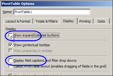
If you’re sharing an Excel pivot table with colleagues who aren’t too skilled in Excel, you might want to hide some of the pivot table buttons and labels before you send it.
Continue reading “Hide Pivot Table Buttons and Labels”
Category: Pivot Table
Count Items in List with Excel Pivot Table
If you have a long list of items, you could use formulas to count how many times each item occurs in the list.
It would take a few steps, including pulling a list of unique items from the list, then creating a formula to count each item. Is there an easier way?
Continue reading “Count Items in List with Excel Pivot Table”
Save Space With Pivot Table Subtotals
When you summarize data in a pivot table, it usually shows a sum of the values. (If there are blanks or text values in the field, usually the pivot table shows a count instead.)
In this pivot table, you can see the total labour cost for each Service Type.

If there are two or more fields in the Row or Column area, subtotals are automatically created for all the fields except the last one.
In the screenshot below, the District field was added below the Service Type field. Subtotals were automatically added to Service Type.

Change the Summary Function
Instead of seeing the Sum of the data, you can change the summary function, and show the Average, or any of the other options. You could even put the same field in the Values area of a pivot table multiple times, and use different summary functions in each column.
In this example, the sum of the labour cost is shown in column C, and the Max function is used in column D.

Change the Subtotal Summary Function
If your pivot table already has lots of columns, you might not want to make it wider, by adding another copy of one of the Value fields.
Instead, you can change the summary function for the Subtotal, so it uses a different function than the Value fields.
Now the Value fields show the sum of labour costs, and the subtotal for each service type shows the highest labour cost that was charged for that service.
You can see the maximums, without adding extra columns to the pivot table.

More Info on Pivot Table Subtotals
You can read more about pivot table subtotals, and the steps for changing them, on the Contextures website: Excel Pivot Table Subtotals.
Watch the Pivot Table Subtotals Video
To see the steps for changing the pivot table subtotals, and creating multiple subtotals, you can watch this short video.
_____________
How to Create Excel Pivot Table from Multiple Sheets
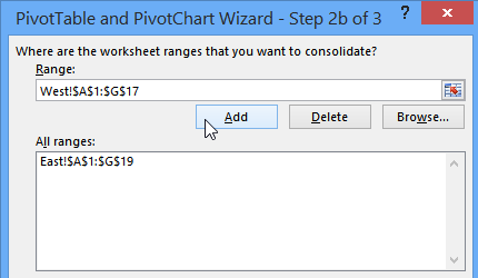
If Excel data is on different sheets, you can create a pivot table from multiple sheets, by using multiple consolidation ranges. My video, further down this page, shows you the steps.
Of course, it’s better if the data is all on one sheet. But, if you don’t have that option, the multiple consolidation ranges will pull all the data into one pivot table.
Continue reading “How to Create Excel Pivot Table from Multiple Sheets”
Dependent Data Validation From Pivot Tables
 Cascading lists and kangaroos? Today, Ed Ferrero shares his technique for creating dependent data validation from pivot tables. Ed’s from Australia, and it looks like we’ll learn a bit about his country too, as we go through his sample file.

Dependent Data Validation
We’ve created dependent data validation drop downs before, based on named ranges, or sorted lists. Ed’s technique is perfect if you have a large data source, and it isn’t sorted in the order that you need.
In this example, there’s a list of States and Cities, with the cities in alphabetical order.

Create the Pivot Tables
Ed created two pivot tables, one with State in the row area, and one with State and City in the row area.

The State labels don’t repeat in the pivot table, so you can’t use the sorted table dependent data validation technique.
Create the Named Ranges
Instead, Ed created a couple of named ranges, and some dynamic ranges.
- The first range is State, which is the list of state names and Grand Total in the first pivot table.
- The second range is StateCity, which is the list of state names and Grand Total in the second pivot table.
Tip: If you reduce the worksheet zoom to 39%, you can see the range names.

Create the Dynamic Ranges
The first dynamic range is for the City heading in the second pivot table.
- CityHeader: =OFFSET(StateCity,-1,1,1,1)
The next two dynamic ranges, StateNo and StateCityNo, use relative references to read the value of the state from the cell to the left of the active cell. For example, if the selected State is in cell A3 on Sheet1, these formulas are used:
- StateNo: =MATCH(Sheet1!A3,State,0)
- StateCityNo: =MATCH(Sheet1!A3,StateCity,0)
Queensland is the selected State, so StateNo =3 and StateCityNo =5.
Then, the next State is found in the StateCity range.
- StateCityNext: =MATCH(INDEX(State,StateNo+1),StateCity,0)
The next State is South Australia, and it’s in row 9, so StateCityNext =9.

Create the Dependent List of Cities
Finally, the dynamic range for the list of cities is created.
- City: =OFFSET(CityHeader,StateCityNo,0,StateCityNext-StateCityNo,1)
The City range is offset from the CityHeader cell, 5 rows down, 0 columns right, 4 rows high (9-5), and 1 column wide.

Create the Drop Down List
The final step is to create the data validation drop down lists. In cell A3, a State drop down list is created, based on the State range.

In cell B3, a dependent City drop down list is created, based on the City range.

Download the Sample File
You can download Ed’s sample file to see how it works: Dependent Data Validation From Pivot Tables. It’s a zipped file, in Excel 2003 format.
About Ed Ferrero
Ed maintains an Excel techniques web site at www.edferrero.com. He is based in Australia, and has been a Microsoft Excel MVP since 2006.
____________
Running Totals Are Easy With Excel Pivot Tables

This week I’m working on a client’s sales plans for the upcoming fiscal year. They forecast sales per month by product and customer, and we use some pretty complicated formulas to sort things out. Of course, anywhere that it makes sense to use a pivot table, I create one. It’s a great way to summarize all the details, and review the overall totals. Running totals are easy with Excel pivot tables!
Continue reading “Running Totals Are Easy With Excel Pivot Tables”
Excel Pivot Tables At the Olympics
Are you too old to compete in the Olympics? Maybe you’re not as bendy as those 16-year-old figure skaters, but there might be other sports with athletes about your age.
Olympic Athlete Data
Athlete bios are posted on the Vancouver 2010 Winter Games website, and I compiled that data, then created a few Excel pivot tables, to analyze the athletes’ ages.
- Which Winter Olympic sports have the oldest athletes?
- Which countries send the youngest participants?
- Do similar age groups compete in different sports?
- Who wears the wildest pants?
With our Excel pivot tables, and some pivot table grouping, we can find the answers to those pressing questions. Well, maybe not the pants issue, but let’s look at the age questions.
Create Excel Pivot Table
Using the Olympic athlete biographical data, I created an Excel pivot table with:
- Sport in the Row Labels area
- Age in the Values area
The pivot table default for the Age field is to show the Sum of Age, and that isn’t too helpful for this analysis.

Show Maximum Values in Pivot Table
Instead of using the Sum function, I’d like to see the Maximum age for athletes in each sport. Fortunately, there is a quick way to change the summary function that is used for a pivot table value field.
To change the summary function in an Excel pivot table Values field, follow these steps:
- Right-click on one of the values in the Age field.
- Click Summarize Data By
- In the pop-up menu, click click Max

Sort the Values
After changing the summary function to Max, the pivot table shows the highest age in each sport.
Next, I can sort the list in descending order by Age. That will highlight the sports with the oldest competitors.
- Alpine skiing is at the top of the list – that was a surprise!
- Short track speed skating has the lowest maximum age

Show a Count of Athletes
Maybe there’s only one Alpine skier, and they’re really old.
To compare the number of athletes in each sport, I’ll add the athlete’s name field to the Values area, and it will appear as Count of Name.

Except for the last two items, there’s a good number of athletes in each sport, with Alpine Skiing as the second largest group.
See Athlete Age by Country
If we replace Sport with Nationality in the Row Labels area, we can see the maximum age and athlete count for each country.

That 51-year-old alpine skier is from Mexico, and is the only athlete from that country. Coincidentally, Great Britain sent 51 athletes, but the oldest is 45.
To see the average age per country, you can change the summary function to Average, then sort the ages in ascending order. The lowest average ages are from countries with a small number of athletes.

Filter by Count of Name
To see the average ages for the larger contingents, we can filter the countries by the Count of Name value. Click the drop down arrow for the Nationality field, click Value Filters, then click Top 10. I selected to see the Top 10 items by Count of Name.

The pivot table now shows only the countries with the largest number of participants, sort by average age. There’s not much difference in the average ages among countries in the top 10 list.

That’s not too encouraging! If I want to compete in the next Winter Olympics, I should move to Mexico, and take up alpine skiing.
Age Range in Selected Sports
Finally, let’s see the age range in a few of the ice sports. I removed Nationality from the Row Labels, and added Sports. Then, I filtered the list, to show only four of the sports – curling, figure skating, ice hockey and speed skating.

Figure skating has the narrowest age range, and curling has the widest. Maybe I can stay in Canada, and learn how to curl.
Instead of showing the individual ages on the chart, I can group the ages into 5 year bands. Right-click on an Age, and click Group. Then enter 5 in the By box, and click OK.

The chart looks less like the Rocky Mountains, and it’s easier to see the age ranges for each sport.

Download the Data
I’ve saved the athlete bio data in a zipped Excel file that you can download, and use it to create your own pivot table. Let me know if you make any surprising discoveries.
To get the sample file, go to the Excel Sample Data page on my Contextures site. Then, for details on what’s in the file, go to the section named Sample Data – Winter Athletes.
The zipped Excel file is in xlsx format, and does not contain any macros.
Congratulations
And congratulations to Alexandre Bilodeau, from Canada, for winning a gold medal in Men’s Moguls at the Vancouver 2010 Winter Olympics.
Yes, it was the first Olympic gold ever won by a Canadian on home soil.
___________
Old Items Appear in Pivot Table Drop Downs
After you update the source data for a pivot table, and refresh the table, some of the old data might still appear in the pivot table drop downs.
For example, you changed a product name from Whole Wheat to Whole Grain, and now both names show up in the pivot table’s Product drop down.
There are written steps and a video below, that show how to fix the problem.

Prevent Old Items in Excel 2007
You can prevent old items from being retained in an Excel 2007 pivot table, by changing on of the pivot table options
- Right-click a cell in the pivot table
- In the pop-up menu, click PivotTable options
- Click the Data tab
- In the Retain Items section, select None from the drop down list.
- Click OK, then refresh the pivot table.

The old items will disappear from the pivot table drop downs, and won’t appear again.
Clear Old Items in Excel 2003
To prevent old items in Excel 2003 pivot tables, you can use programming to change the MissingItemsLimit setting.
Or, you can manually clear the old items, by following these steps:
- If you manually created groups that include the old items, ungroup those items.
- Drag the pivot field that contains old items out of the pivot table. Also remove it from any other pivot tables that use the same pivot cache.
- Refresh the pivot table.
- Drag the pivot field back to the pivot table.
This will clear the existing old items, but won’t prevent more from appearing later.
Watch the Video
To see the steps to change the retain items setting in Excel 2007, you can watch this short video.
______________
For more information on Pivot Tables, see the Pivot Table Tutorials on the Contextures Website.
______________
Athlete Height Weight Analysis Pivot Table
 Occasionally, a football game appears on the television at my house. I’m talking about real football, with burly men in tight pants, not that other kind of football, with wiry men in shorts.
This weekend, one of the games was between teams from Arizona and New Orleans. While admiring the strategies of the two teams, I noticed that the players whose numbers were in the 60s and 70s seemed heavier than the others.
Was that an optical illusion? Did their numbers, or some extra padding, make them seem bigger? Or were they really larger than the rest of the team?
Excel Weight Analysis
Excel can help you with burning questions such as these. From the NFL site, I copied the player roster for each team, and pasted it into Excel.
Unfortunately, the player heights were entered as feet-inches, e.g. 6-1, so that took a bit of fixing, because Excel helpfully changes numbers in that format to dates. A few players didn’t have numbers listed, so I changed those to zero.
Make a Pivot Table
After the player rosters were pasted into Excel, I created a pivot table from the data.
I put the player numbers into the pivot table Row area, Team name into the Column area, and Weight into the Values area, as Average.
Then I grouped the pivot table Player Numbers into 10s.

Average Weight in Pivot Table
As I suspected, the 60s and 70s are much heavier than their teammates. Only the 90s come anywhere close.

Maybe It’s Not the Number
Admittedly, I don’t know too much about how the player numbers are assigned. Maybe each position gets a specific number range and some positions need bigger players.
So, I created another pivot table, to check the average weight of players in each position, and see which numbers are assigned. A bit of conditional formatting was added, to highlight the different weight ranges.

And it does look like the Guards and Tackles are assigned numbers in the 60s and 70s. The lower numbers have lower weight players, and the 80s have a middle range.
BMI Status
Since we created a Body Mass Index formula a couple of weeks ago, I added that to the player stats too. Then a VLOOKUP formula pulled the BMI status from a lookup table, and a pivot table showed the number of players in each status (Normal, Overweight or Obese).
I’m sure their muscles put the players into different BMI categories than the rest of us, but there aren’t many guys in the Normal category.

Team Weights
Finally, I created a table to compare the player weights on each team. Overall, the Arizona team is a bit heavier. Maybe that slowed them down, and that’s why they lost the game.

Download the Workbook
If you’d like to do your own team weight analysis, you can download the sample workbook from my Contextures website. Go to the Excel Sample Data page, and scroll down to the Football Player section. The zipped file is in xlsx format, and does not contain any macros.
[Update – August 2022]: I’ve added 2022 player data to the workbook, for the same two football teams. Now there are 306 player records for you to analyze!
Anyway, the football season should be over soon, and the players can use the Excel Calorie Counter to get themselves in shape for next year. Only if they want to, of course – I’m certainly not going to mention weight loss to any of them!
_____________
Drill Into Data With PowerPivot
Have you tried Microsoft PowerPivot for Excel 2010 (formerly Gemini)? It’s a powerful data analysis add-in for Excel, and is part of the Office 2010 Beta.
If you haven’t downloaded the Beta, you can test PowerPivot in the hands-on Virtual Lab.
That’s where I tested PowerPivot last weekend, and hit a few snags, but was impressed by what PowerPivot can do.
Testing PowerPivot
On Friday, a surprise package arrived in my mailbox – a set of power tools! It was a promotion for last week’s release of PowerPivot, and the power tools had clever labels, like this one on the flashlight.

Did the power tools influence my decision to try PowerPivot?
Of course! Testing PowerPivot was already on my To Do list, and the power tools inspired me to move it to the top.
Will the gift influence my testing? Nope. I’ll still tell you exactly what I think.
The PowerPivot Add-In
I had trouble with the virtual lab on my desktop computer, and couldn’t get the ActiveX control installed.
Next, I tried on my laptop, which is newer, and everything went smoothly there. Both machines are Windows XP, and I used Internet Explorer 8 as the browser.
Start the Virtual Lab
Once the virtual lab was running, it was easy to get started, and work with PowerPivot in Excel.
The PowerPivot add-in creates a new tab on the Excel Ribbon.

Launch PowerPivot
Click PowerPivot Window, to launch the add-in, and open the PowerPivot client window. From there, you can connect to data from a variety of sources.
I’d normally connect to Access data, but in this example I used the SQL Server connection.

Select a Table in Data Source
Next, select a table from the data source, and PowerPivot can automatically select related tables. You can also filter the selected data, before importing it.
In the virtual lab, I connected to a Sales table that had almost 4 million records, and it took just a couple of minutes to import.
The Imported Data
In the PowerPivot client window, each table is on a separate tab.
You can change the tab names, and add calculated fields in the tables.
The formula bar looks just like Excel’s, and the field names appear automatically when you start typing.

Create a Pivot Table and Pivot Chart
You can create a pivot table and pivot chart from the data, using the PowerPivot Task Pane (called the Gemini Task Pane in the virtual lab).
The pivot table and pivot chart weren’t connected though – adding fields to one, didn’t affect the other.
I’m not sure if that was a bug in the virtual lab, or a Beta feature that will be fixed later.

Add Slicers
You can also add horizontal and vertical Slicers to the pivot table and pivot chart, to filter the data that’s displayed.

Try PowerPivot Yourself
This was just a quick overview of the PowerPivot test in the PowerPivot virtual lab. If you don’t have the Office 2010 Beta installed, I’d recommend this as a great way to see what PowerPivot can do.
It took me about an hour to go through the 3 modules, while making notes and taking screenshots.
Read the PowerPivot Instructions
There’s a button to download a PDF file with the instructions, but that didn’t work, so I copied the instructions and pasted them into Word.
It was easier to read the instructions in Word, where I could increase the Zoom level. Also, the instructions disappeared at one point, and I would have had to start over, if I hadn’t made a copy.
The virtual machine hung on me a couple of times, and I don’t see a way to start anywhere except the beginning.
Restarting was annoying, but it was pretty quick to go through the steps the second time.
_______________
For more information on PowerPivot, see the PowerPivot Team blog.
For more information on Excel Pivot Tables and Excel Pivot Charts, see the Pivot Table FAQs on my Contextures website.
___________________