My clients sometimes ask for help with building Excel dashboards, so they can present a summary of their data to their customers and co-workers.
In a dashboard, you want to make the best use of limited space, and only show key information. For example, instead of showing all the sales data, you can show just the highest and lowest values.
MIN and MAX Functions
It’s easy to pull the top and bottom values from a list, by using the MIN and MAX functions. It’s a little trickier though, if you want to show the high and low amounts for a specific product in a long list.
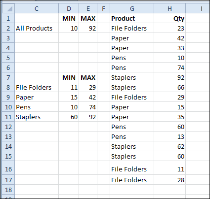
In this example, I want to calculate the MIN and MAX for each product, then put that information on the dashboard
Create a MIN IF or MAX IF formula
There’s no built-in MINIF or MAXIF function, but you can use MIN or MAX with the IF function, to create your own. The steps are shown in the video, at the end of this article.
First, to get the minimum quantity sold for File Folders, the array formula in cell D8 is:
=MIN(IF($G$2:$G$17=C8,$H$2:$H$17))
After you type the formula, press Ctrl + Shift + Enter, so it is array entered.
The same technique is used in cell E8, with MAX, instead of MIN:
=MAX(IF($G$2:$G$17=C8,$H$2:$H$17))

Excel Dashboard Course
If you’d like to add dashboard skills to your Excel tool kit, I recommend the upcoming Excel Dashboard Course offered by Mynda Treacy from My Online training Hub. Mynda is an accountant, and her dashboards focus on the numbers, not the fluff.

There are 9 sessions in the course, with video tutorials that are short and to the point. They cover the key steps and features, and you can practise the techniques in the sample files. Replay the videos as often as you need, for up to 12 months. The course includes 6 weeks of support from Mynda, so you can post questions, read comments, and ask her to review your completed dashboard.
This course is not for Excel beginners, because the fast pace could be overwhelming. Lots of material is covered, very quickly. And, if you’re already a dashboard expert, you won’t need this course. It’s designed for Excel users who are beyond the basics, and who enjoy learning by seeing a demo, then practising the new skills.
You can see the course details and a sample video here: Excel Dashboard Course
Registration is only open for two weeks, until August 14th, so don’t wait!
Watch the Min and Max Video
To see the steps for creating MIN, MAX, MIN IF and MAX IF formulas, please watch this short video tutorial.
_______________________________

