Today we’ll create an in-cell chart that shows the latest price for a stock, compared to its low and high prices. There is a sample file available for download, and a video that shows the steps.
Simple Dot Plot Chart
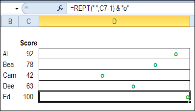
You can create a simple chart on a worksheet, by using the REPT function. Most in-cell dot plot charts are for a standard scale of 0-100 points, such as test scores. In the screen shot below, the REPT function repeats the space character based on the score in column C, and displays the last character as a lower case “O”, for the chart’s dot.
Dot Plots for Variable Scales
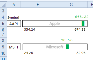
In addition to standard scales, you can also use an in-cell dot plot with a variable scale, such as stock prices. In the example below, the Apple price ranges from $354 to $663, over the past 52 weeks, and the Microsoft price is in a much smaller range — $24 to $32.
Instead of a simple REPT formula, the formula calculates where the marker should fall in the range, and places a dot for the latest price on a scale that runs from the lowest to the highest price.
Set Up the Measuring Cells
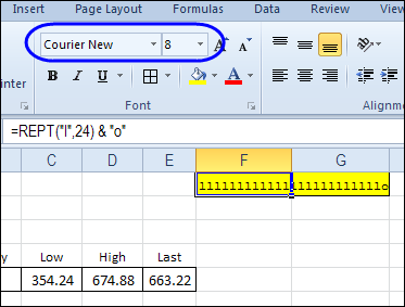
The first step is to set up a two-cell range at the top of the worksheet, where the scale measurement will go. In cells F1:G1, I entered a REPT formula that shows 24 “L” characters, and a lower case “O”.
The measurement range is formatted in Courier New font, because it is non-proportional – all characters are allotted the same width. The same font and font size (8) will be used in the in-cell dot plot ranges.
I adjusted the width of columns F and G so the “O” just touches the right edge of column G.
Count the Characters
The number of characters in the measurement range will be used to calculate the marker position, so enter this formula in cell H1:
=LEN(F1)

Select a Marker Symbol
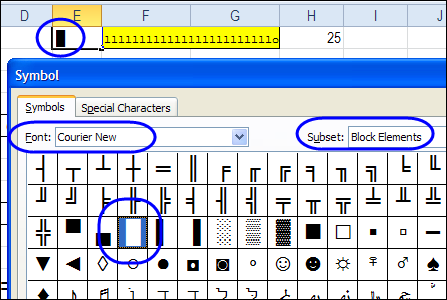
Next, use the Symbol command on the Ribbon’s Insert tab, to select a marker for the stock price. You can use a simple lower case “O”, if you like, or go for something more exotic.
In cell E1, I inserted a Full Block symbol from the Courier New font set, in the Block Elements subset. In the REPT formula, we can refer to that cell, to show the selected symbol. This makes it easy to change the symbol later, if you decide to use something else.
Create the REPT Formula
The next step is to create the REPT formula for the first stock price – Apple — in row 5.
- Format cells F5:G5 in Courier New font, size 8, to match the measurement box settings.
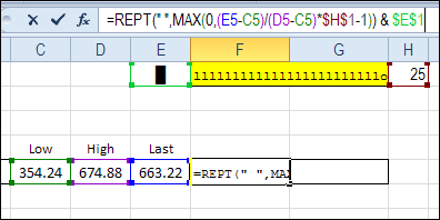
- Enter the following formula in cell F5:
=REPT(” “,MAX(0,(E5-C5)/(D5-C5)*$H$1-1)) & $E$1
- The formula divides the distance from the lowest price to the current price, by the full length of the price range.
- That amount is multiplied by the number of characters in the measurement cell, and 1 is subtracted from the total.
- The MAX of that amount or zero is used as the number of space characters.
- The symbol in cell E1 is added to the end of the string.
- Copy the formula to cell F9, where the Microsoft chart starts.
Format the Dot Plot Chart
To make the marker stand out on the worksheet, you can change the font colour in the dot plot chart cells. In this example I used green font.
Then, in cells F6 and G6, link to the Low and High stock prices.
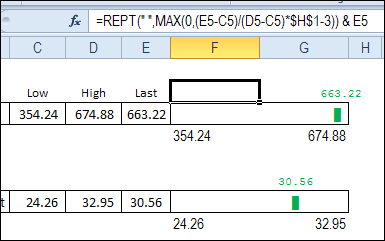
In cell F4, use the same REPT formula, but subtract 3 from the number of spaces, and end with the Last stock price, instead of a symbol.
=REPT(” “,MAX(0,(E5-C5)/(D5-C5)*$H$1-3)) & E5
- Because 3 is subtracted, instead of 1, the price is centred over the marker.
- Change the font colour in F4, to match the marker colour.
- Copy the formulas to rows 8 and 10.
Hide the Setup Rows and Columns
To finish the worksheet, hide the top row, where the setup cells are, and hide the columns with the stock prices.
I’ve left a column with the stock symbol showing, and added a text box that is linked to the company name.
Instead of showing the cell border, I added a border to the text box, and it starts a little to the right of the cell’s border.

Dot Plot Chart Utility
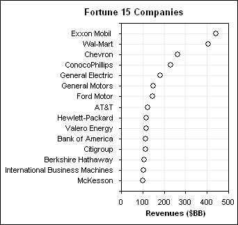
For a quick and easy way to create standard Dot Plot charts, you can buy Jon Peltier’s Dot Plot Chart Utility. Enter your values on the worksheet, and use a wizard to create the chart. Then, you can add your own formatting, such as different fonts and colours.
Download the Sample File
To download the sample file, visit my Contextures website. On the Excel Sample Files page, in the Charts section, look for CH0005 – Dot Plot Stock Chart. The file is in Excel 2007/2010 format, and is zipped. There are no macros in the file.
Watch the Stock Chart Video
To see the steps for creating this dot plot stock chart, watch this short video tutorial.
__________________

You guys are the best!!!!!! Thank you!
I like playing with this; an excellent intro into the charting. 🙂
You could try this if you wish to include a grid:
=REPLACE(REPT(“| “,$H$1)&”|”,2*MAX(1,INT($H$1*(E9-C9)/(D9-C9))),1,$E$1)
And, same correction for the number above the dot (additionally ensured to be kept within)
=REPT(” “,MIN(2*$H$1-3,MAX(0,2*INT($H$1*(E9-C9)/(D9-C9))-3))) & E9
Thanks Debra,
It seems to work nicely with the selected column width and window zoom setting.
But when I change the zoom to 75 and change column widths, it seems to fall down.
Is there a way to handle these issues at run-time based on user settings/preferences?
Thanks.
Very nice an innovative. This is exactly what i was looking for. Thank u for the wonderful tutorial