As you know, pivot tables are a quick and easy way to summarize a huge table of data in Excel. With just a few clicks, you can create totals for thousands of rows of data, without writing a single formula. Then, with filters and Slicers, zero in on specific parts of the data. But there’s an underused feature that you might be missing – do you know how to compare pivot table values as percentages?
Meet Karine Lago
Karine Lago is an Excel MVP from Brazil, and you can see her work on her YouTube channel, and her Excel blog – both are in Portuguese. Karine has posted almost 100 YouTube videos since 2013, and she covers Excel, VBA and Power BI topics.
Recently, Karine invited me to do a guest video her YouTube channel. As a topic, I suggested “How to compare Pivot Table values as percentages”, and Karine thought that would be a good fit for her audience.
I don’t speak Portuguese, so I recorded in English. Later, Karine added an introduction, and closed captions with the translation. You can see the final result below. Thanks, Karine – it was a pleasure to work with you!
Show Values in Pivot Tables
Before you watch the video, here’s a little bit about the topic.
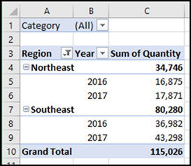
Most pivot tables show a sum of the numbers from the raw data – that’s the default setting when you add a number field to the pivot table.
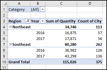
Or, if you add a field with text in the Values area, Excel automatically shows a count of the items in each total. And no, there isn’t any way to change the default calculation, so it always uses SUM.
Change to Percentages
Instead of leaving the numbers as the default, you can change them, to make it easier to compare the values in the pivot table.
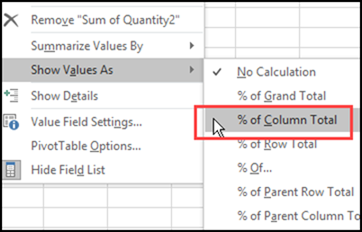
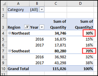
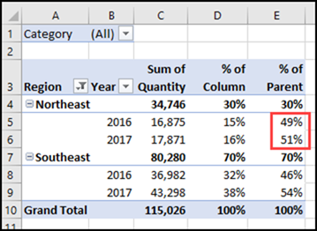
For example, in the pivot table below, I added a second copy of the Quantity field. Then, I right-clicked on a number in that new column, clicked Show Values As, and selected % of Column Total.
The new column shows the percentage that was sold in each region, in each year, compared to the overall total quantity. I formatted the column with zero decimal places, so it’s easier to read.
Now, instead of trying to mentally compare the large numbers in the region subtotals (34,746 and 80,280), you can quickly see that 70% of the quantity was sold in the Southeast region, and only 30% in the Northeast.
More Options for Show Values As
There are many other options in the Show Values As list, including % of Parent settings. The Parent options let you compare items within a subtotal, such as Region.
NOTE: The Parent options were added in Excel 2010, when “Show Values As” was added to the right-click menu.
In the next screen shot, I’ve added a third copy of the Quantity field, and set it to show % of Parent Row Total. In the % of Parent column, you can see that 51% of the Northeast sales were in 2017, compared to 49% in 2016.
In the video, I also show how to add a column with % of Parent Total. That option is a little different from the others – you can select a specific Row field, and compare all the values within that field item.
Watch the Video
Here is our video that shows how to compare pivot table values as percentages. You’ll see the steps for building the basic pivot table, then three ways to compare the values –
- % of Column
- % of Parent Row
- % of Parent Total
Karine does an introduction in Portuguese, then an English intro at the 2:24 mark, and my tutorial starts at the 2:55 mark.
________________________


