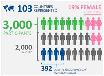
The ModelOff Live Final for the 2013 Financial Modeling World Championships were held last December, in New York City, and Hilary Smart, from London, was the winner.
The organizer have just published an infographic about the competition, and you can see the full image on their blog.

Contextures Posts
Here’s what I posted last week:
- To find the last item in a list category, you can use a formula with the INDEX and MATCH functions.
- In Excel 2010 and later, you can turn repeating item labels on and off in a pivot table
- To make your favourite commands easier to use, you can add them to the Quick Access Toolbar. Show the buttons for all workbooks, or just one.
- Finally, for a humorous peek at what other people are saying about Excel, read this week’s collection of Excel tweets, on my Excel Theatre blog.
Other Excel Articles
Here are a few of the Excel articles that I read last week, that you might find useful:
- On Microsoft’s Excel team blog, Jeff Johnson shows 4 ways that you can filter your data, to show only part of the data in a chart.
- Ken Puls is in the design stage of a new reporting system for his company. He’d like to know how you start designing software, so leave a comment on his blog post.
- On the Daily Dose of Excel blog, Jeff Weir shows how you can add leader lines to non-pie charts, in Excel 2010 and earlier. If you have Excel 2013, this feature is now built-in.
- It’s not just Excel that changes its format occasionally, causing compatibility problems with older versions. John Thysell explains the pain of maintaining spreadsheets in OpenOffice / LibreOffice.
- Do you have a favourite Excel book? Chandoo shared his top picks, and you can see other people’s choices in the comments. Add your own list of favourites to the discussion.
- Mike Alexander shows how to use Power Query to combine data from multiple Excel files into one table. It’s an amazing way to clean up your data, and you can see a demo in the End-to-End Power BI webinar (see the 24 Hour PASS Replays link below)
Online Courses
- Last week, there were free Business Analytics courses online, in promotion of the upcoming PASS conference. If you missed them, the replays are available: 24 Hour PASS Replays
- Chandoo has just re-opened his Power Pivot online course, and you can get the course info and registration details here: Power Pivot Course
What Did You Read?
If you read any other interesting Excel articles last week, that you’d like to share, please add a comment below.
Please include a brief description, and a link to the article.
__________________________________

I’ll admit I don’t know much about financial modeling, but if it involves visualizations, the organizer would surely lose based off that infographic. Using the people icons is cutesy, but there are several occasions where it’s downright confusing. Take the snipped you posted, for example. It looks like the 7 green people are from 2013, but if you do the math, all 30 people must be from 2013. Similarly, it’s not the 14 gray people that are from 2012, it’s the 20 from the bottom two lines.
Bryan, I agree, the infographic is confusing. The bracketed section represents the 2000 people in 2012, but all three rows are the 2013 participants.