If you’re analyzing sales data from year to year, you can make a line chart that shows each month’s sales. That lets you see if there were any months with big differences, and shows how sales went up and down over the year. Another option is to use a Running Total to compare years in Excel. It’s quick and easy to set up with a pivot table and pivot chart.
Show Monthly Totals
The quickest way to summarize the annual data is with a pivot table. In the example shown below, the sales date has been grouped by month and year. The year is in the Column area, and the Month (Date) is in the row area. The Sum of quantity is shown in the Values area.
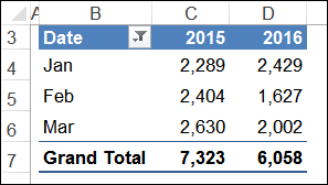
Create a Monthly Chart
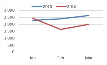
A line chart from this summary shows the total for each month, year over year. It shows that 2016 started out well, hit a slump in February, and picked up a bit in March.
It doesn’t show the total per year though, and there isn’t a way to include the pivot table Grand Total in a pivot chart.
Show a Running Total
Another way to show the data is to create a Running Total. Instead of just seeing each month compared to that month in the previous year, see the overall total at each point in the year.
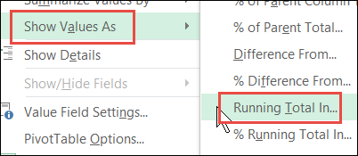
Make a copy of the first pivot table, and change its values to show a Running Total:
- Right-click on one of the amounts in the Value,s area
- Click Show Values As
- Click Running Total In
- Select Date as the Base Field.
There are instructions and a short step-by-step video on my website.
The new pivot table shows the Running Total over the months for each year.
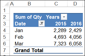
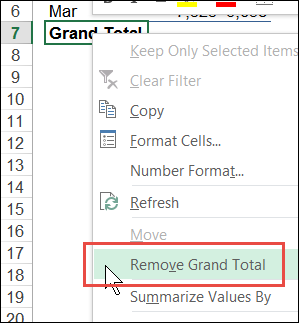
You could remove the Grand Total, because it is empty when a Running Total is shown.
Make a Pivot Chart for Running Total
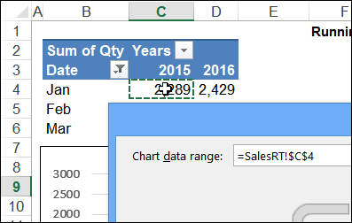
Instead of creating and formatting a new pivot chart, re-use the old one, by making a copy and changing its source data. There’s a video of these steps on my Contextures site.
- Copy the old pivot chart (for the monthly pivot table).
- Then, paste it into another workbook temporarily. Cut it from that workbook, and paste it onto the sheet with the new pivot chart
- Right-click the chart, and click Select Data (NOTE: if you right-click in the Plot area, you’ll see a short pop-up menu)
- Click in the Chart Data range box, and click on any cell in the Running Total pivot table
- Click OK, to close the dialog box.
Running Total to Compare Years
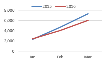
In the new chart, you can see the Running Total, to compare years. It shows that the 2016 total is less than the previous year, even though it started out a hit higher in January.
Show Both Pivot Charts
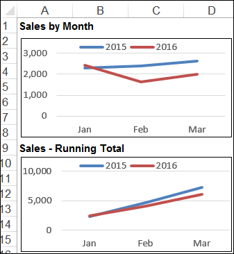
Instead of keeping the pivot charts on separate sheets, you could put both charts on a dashboard, to show different views of the same data. Two pivot charts are better than one! Well, almost always.
________________
