A box plot (box and whisker chart) lets you show how numbers are distributed in a set of data. Excel doesn’t have a built-in chart type for a box plot, but you can create a simple box plot in Excel, using a stacked column chart, and error bars.
Video: Build a Simple Box Plot
To see the steps for building a simple box plot, from a stacked column chart and error bars, you can watch this short video tutorial.
There are written steps below the video
Simple Box Plot in Excel
A box plot (box and whisker chart) lets you show how numbers are distributed in a set of data. Follow the steps below, to build this simple box plot.

Do the Calculations
To build a box plot, you’ll need to do a few calculations for each set of data: Min, Quartile 1, Median, Quartile 3, and Max.
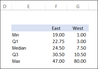
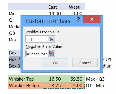
From those calculations, you can figure out the height of each box, and the length of the whiskers. The diagram below shows where each measure appears in the box plot.
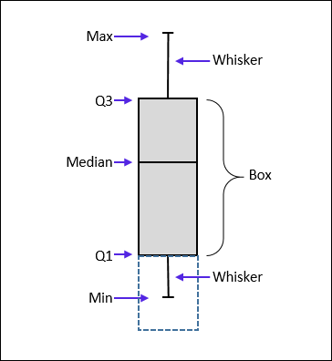
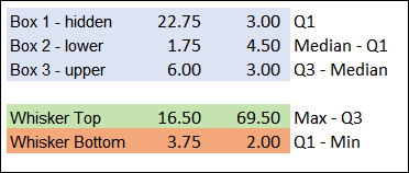
Just subtract the bottom measure from the top one, to get the height/length. For example, the upper box height is Quartile 3 minus the Median.
Build the Chart
Once you have the box and whisker measurements, you can build a stacked column chart from the box measurements, and hide the first box, by removing its fill colour.
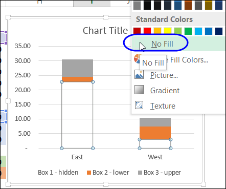
For the whiskers, create a positive error bar in the upper box, and a negative error bar in the hidden box, using the values that you calculated.
Details and Download
To get the details on these steps, and to download the sample file, you can visit the Create a Box Plot page on my Contextures website. The steps are also shown in the video at the end of this article.
Quick Build with the Excel Charting Utility
The above example is a very simple box plot, with no frills. If you need to create something more complex, and need it done quickly, you can invest in the Peltier Tech Charting Utility. It lets you create a Box Plot, Waterfall, or other complex Excel charts with just a few clicks.
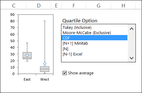
Here’s the box plot that I created using the charting utility – it has an average marker, and several options for the quartile calculations. All I had to do was select a cell in my data, and click a couple of chart layout options.
You can see how the utility works in this video that I recorded.
_______________

This is wonderful!! Thanks for the tutorial, you don’t have idea how you save my day!!! 🙂
I would like the Box Plot values also to get displayed on the chart. But due to the intermediate step, I am not able to get the original values. How do we get the actual box plot values on the chart?
Thanks for this! There is no other tutorial on Google like it, spent ages looking and this is by far the best one!
Hi,
This is very useful. However, I wonder what I should do with the whiskers when using negative values. I can’t get the bottom whisker correct….
This is great, thank you very much!
Hi,
Can you anyone advise how to prepare team accuracy box & whisker chart.
Could you plese explain how you can do a box and whisker plot if you have both negative and positive values
Could you please explain how you can do a box and whisker plot if you have both negative and positive values?
Can we categorize X axis ?
Example :: Y axis – traffic, number of cars and X axis – year and city?