It’s week two in the free online Infographics and data visualization course, led by Alberto Cairo, and I’m working on this week’s assignment.
The discussion this week is about a New York Times graphic that shows the number of times that words were used at national conventions.
The words are shown in blue and red (pink?) bubbles, representing the party colours, and you can add other words to the graphic, to see how they fared.

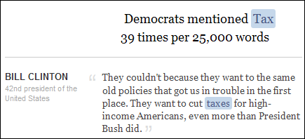
If you click on a circle, the selected word is shown in context, below the graphic, in various speeches.
Improvements to the Infographic
There were things that I liked about this infographic, and a few things that could be improved.
The positives:
- The circles gave a quick overview of the word usage, and showed the party split on each word.
- Words that were used more often my Democrats fell to the left, and Republican favourites fell to the right.
- It was easy to enter a new word, and see where it fell
- It helped to see the words in context, below the graphic, to understand how they were used
The negatives:
- It was hard to see some of the words, in the smaller circles
- The words were hard to find, because they were in random order, on either side of the graphic
- It wasn’t clear how or why the words in the infographic were selected. There must have been thousands of words used in the speeches, and only a few were shown.
Show the Word Usage in Excel
It would take a huge database to store all those speeches, and analyze them. Excel probably couldn’t handle that, but it can do a smaller version of the word usage graphic.
In an Excel chart, I could arrange the words alphabetically, so they’re easier to find, or sort by total times used, or show highest use by each party.
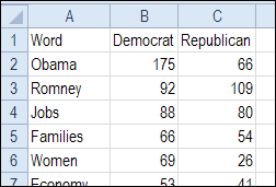
To start, I listed a few of the words, and the number of times they were used by each party.
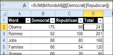
I formatted that list as an Excel table, named tblWordsAll, and added a total in each row.
=SUM(tblWordsAll[@[Democrat]:[Republican]])
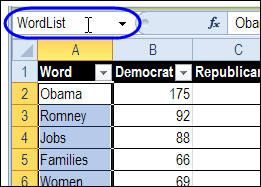
To finish the table, I named the data in the first column – WordList.
Create a Short List of Words
Instead of showing all the words in the a chart, I’d like to select a few from the main list. So, I created another table, named tblWordsSel, with a drop down list in the first column.
The drop down is a data validation list, using the WordList range as its source.
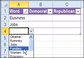
I selected three words, to use in the chart, and then sorted the words in ascending order (A-Z).
Filling Table Formulas Across Is a Drag
To pull the related numbers from the main table, I added INDEX / MATCH formulas in the next two columns.
=IFERROR(INDEX(tblWordsAll[Democrat],
MATCH([@Word],tblWordsAll[Word],0)),0)
Usually I would drag a formula across, to fill in the next column, but I can’t find a way to create an absolute reference to a table column. Am I missing something obvious?
If I drag the formula over to the Republican column, it shifts from looking in the Word column, to looking in the Democrat column.
So, I copied the formula, and pasted it into the formula bar with cell C2 selected. Then, I changed the reference for the INDEX to Republican instead of Democrat. There must be a better way!
=IFERROR(INDEX(tblWordsAll[Republican],
MATCH([@Word],tblWordsAll[Word],0)),0)
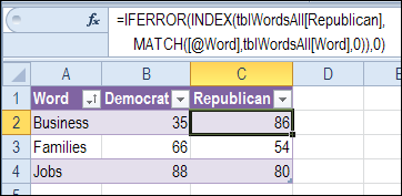
Chart the Results
To show the results in a chart, I selected a cell in the small table, and on the Excel’s Ribbon, clicked the Insert tab.
From the Bar Chart drop down, I clicked on Stacked Bar, to create this chart. How convenient – it even defaulted to the correct colours!
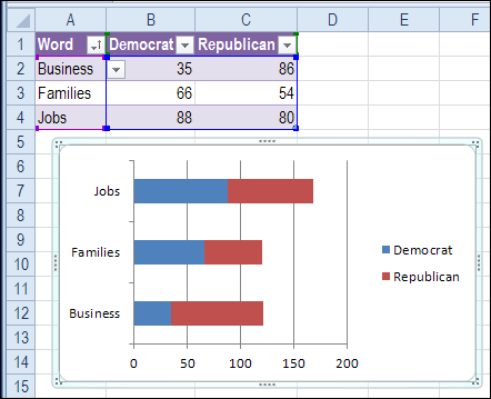
There are a few changes to make, so the chart looks better:
- Right-click the Category Axis, and click Format Axis
- in the Axis Options, check ‘Categories in Reverse Order’ and for ‘Horizontal Axis Crosses’ select ‘At Maximum Category’
- On the Ribbon’s Layout tab (under Chart Tools), click Legend, and move it to the bottom
- Also on the Layout tab, click Data Labels, and choose Center.
- Change the Data Labels font to white, for better contrast.
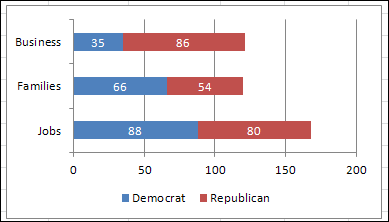
And here is the completed chart.
Add More Words
Just like the original infographic, you can add more words to this Excel Chart.
- Click in the last cell of the small table, and press the tab key, to go the first cell in a new row.
- Select a new word from the drop down list, and it is automatically added to the chart too.
After adding or changing the word selections, you can sort the Word column alphabetically again, so it’s easier to find the words.
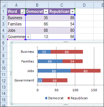
Chart Enhancements
This simple chart lets you compare the word usage between parties, and see which words were used most overall.
There is room for improvement though, and here are a couple of features that you could add:
- The word list for the chart has to be sorted manually in this version. Add a macro to sort the list automatically if the words change.
- Add a Total column to the short word list, and an option to sort by that column, A-Z or Z-A.
What else would you add as an enhancement?
Download the Sample File
To download the sample file, please visit my Contextures website: Excel Sample Files – Charts and Graphics Section. In that section, look for CH0006 – Word Usage Chart
_________

Hi,
—
Usually I would drag a formula across, to fill in the next column, but I can’t find a way to create an absolute reference to a table column. Am I missing something obvious?
If I drag the formula over to the Republican column, it shifts from looking in the Word column, to looking in the Democrat column.
—
I don’t use tables, so I’m not sure if this will work for you – it does with Named Ranges.
In the formula use a reference Indirect(B$1) instead of the text.
Then, when you drag across, the formula will reference the new column Header (C$1)
Give it a try with a normal range with the columns as named ranges.
Hope this may help
Regards
Gary
@Gary, thanks for the workaround. I hope that we’ll have the ability to make absolute table references one day.
RE filling is a drag:
click in the cell with the formula, hold and select the cells you want to drag across (dont do this using the drag handle in the bottom right of the cell, just click anywhere else in the cell) and then with all the cells highlighted, hit ctrl+r. Dont ask me why! but it copies the formula into the highlightes cells without updating the field names.
😛
@chris, thanks, your technique will help when I don’t want any of the table references to change.
We still don’t have a way to create both absolute and relative table references in the same formula though, and only have some of them change when copying across.