![]() Last week, someone tweeted a wish for a new Excel Chart type:
Last week, someone tweeted a wish for a new Excel Chart type:
- “It’s 2010… come on Excel… all I want for Christmas is a 3d scatter chart, it’s not too hard! I don’t want to have to fire up Processing!”
If you could have one new Excel feature, is that what you’d ask for? Maybe not, but if that tweeter reads to the end of this blog post, there’s a link that will help.
Line Chart Vs Scatter Chart
Can you spot the differences between an Excel line chart and an XY (scatter) chart?
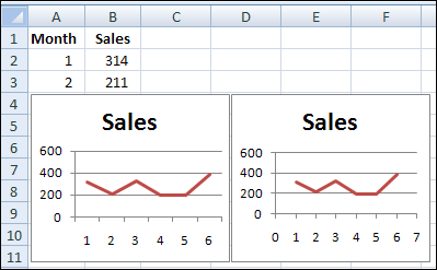
The two chart types can look very similar, as in the monthly sales example shown below.

Excel Scatter Chart
Did you recognize the scatter chart as the one on the right?
There are slight differences in the X axis, for the two chart types, and how the data points line up with the axis labels.
Chart Type Differences
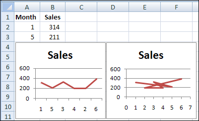
However, if the month numbers aren’t listed in order, the difference between a line chart and scatter chart become more obvious.

Line Chart Month Numbers on Axis
The line chart, at the left, treats the month numbers as text labels.
- The numbers on the X axis appear in the order they’re listed in the chart’s source data.
- Each data point is matched to its label, in the order they’re listed in the chart’s source data.
- The line chart is blissfully unaware of any values attached to the labels.
Scatter Chart Month Numbers on Axis
The scatter chart, at the right, recognizes the numeric values in column A of the chart’s source data.
As a result, the chart looks like a wacky connect-the-dots puzzle.
- The numbers on the X axis are in correct numeric order.
- Each data point is matched to its label’s value. The line goes from 1 to 5, back to 3, then 4, 2 and 6.
- The scatter chart recognizes the numeric values attached to the labels.
Line Chart Vs Scatter Chart For Dates
One type of numeric label that a Line chart DOES recognize is a date.
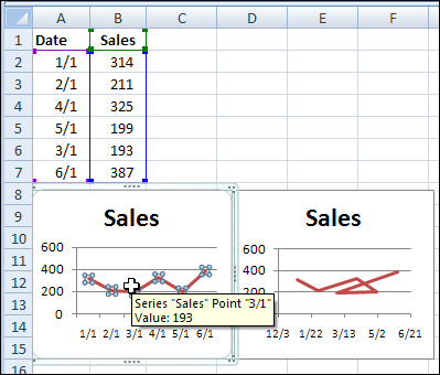
If the numbers in column A are changed to dates, the Line chart plots them correctly, even if the months are not listed in chronological order.
For example, March is near the bottom of the source data, but is the third data point in the Line chart.

Dates in Scatter Chart Axis
The scatter chart formats the numbers on the X axis as dates, but shows them in 50-day intervals, instead of showing the first date of each month, as the Line chart does.
The scatter chart plots the dates in the order listed, unlike the line chart.
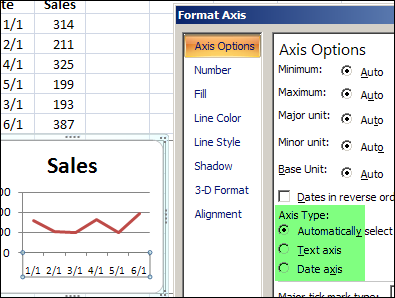
When Excel recognizes dates in the labels column of the source data, a Line chart uses a Date axis, instead of a Text axis.
You can allow Excel to automatically select the best axis type, or manually select the axis type that you prefer.

More on Excel Charts
For anyone who wants a 3D scatter chart in Excel, you can use Andy Pope’s 3D XY Scatter Chart — until Microsoft builds one into Excel.
And for more tips, tutorials and videos on Excel charts, go to the links below, to visit my Contextures website.
___________

One thought on “Excel Line Chart and Scatter Chart Compared”