
What the heck is a box and whisker chart, and why would you need one? Well, I’m not a statistician, but here’s my overview.
A box and whisker chart can give you a snapshot of each series in your data.For example:
- What are the highest and lowest numbers?
- What was the median number?
- What was the range of numbers on either side of the median?
Note: This chart type is also called an Excel Box Plot chart
Sales in a Line Chart
For example, you’re in the retail business, and have three stores.
Store03 opened at the beginning of the year, and got off to a slow start, but did very well at the end of the year.
A line chart lets you compare the store sales over the year.

Sales in a Box and Whisker Chart
Instead of showing data over time, a box and whisker chart shows the data in numerical order, divided into 4 equal sections (quartiles).
- For each store’s sales, you can calculate the MIN, MEDIAN and MAX.
- Then, calculate the median for each half, to find the lower quartile (Q1) and upper quartile (Q3).

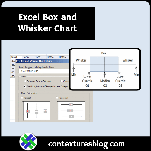
Parts of a Box and Whisker Chart
From those five numbers, you can build a stacked bar or column chart with error bars, to create a box and whisker chart.
For example, the left whisker starts at the minimum value, and stops at the first quartile.

No Built-In Box and Whisker Chart
Excel doesn’t have a Box and Whisker chart type, so I built one by following the box and whisker chart instructions on Jon Peltier’s web site.
The chart shows the narrow range of values in Store01, compared to the wide range at Store03.

Spot the Differences
Box plots don’t always show perfect symmetry, but Store 3 has a strange box plot appearance because of its very low sales in the first half of the year.
- Note the difference from the 7th smallest value (12) and the 8th smallest (80).
- It’s as if there were two different stores, one averaging 6 for 7 months, and one averaging 90 for 5 months.
________________________________
Excel Box and Whisker Chart
________________________________
0 thoughts on “Make Excel Box and Whisker Chart-Box Plot Chart”